- Introduction
- The Project
- Board Game Patterns
- Episodic & Regular
- Asynchronous
- Objective
- Roles & Responsibilities
- Communication
- The Board
- Uncertainty & Discoverability
- Tactility
- The Hand & The Board
- The Prototype
- Designing for Togetherness
- Setting up a Game
- The Narrative
- Objectives
- Randomness
- Time Pressure
- The Map
- Communicating
- Shared Reveals
- Cross-Screen Interactions & Attention Division
- The Results
- Methodology
- Analysis
- What worked?
- What didn’t work?
- Improving the Prototype
- The Guidelines
- Togetherness
- Social Connection
- Engagement
- Evaluating the Guidelines
- Applying the Guidelines Outside of Games
- Writers’ Room
- Studio Session
- Colab
- Conclusion
- Further Reading
- Acknowledgments
Introduction
This research project introduces and evaluates concepts of remote togetherness as well as design patterns for remote social interaction. The COVID-19 pandemic highlighted the demand for software that enhances remote togetherness. Inspired by board games, we designed a prototype with rules of interactions around a shared space and conducted a qualitative study evaluating its effectiveness in bridging the remote social gap. We now propose a set of guidelines anyone can use to design remote multiplayer applications promoting togetherness, social connection and engagement. We further apply these guidelines to various concepts to demonstrate their application outside of games.
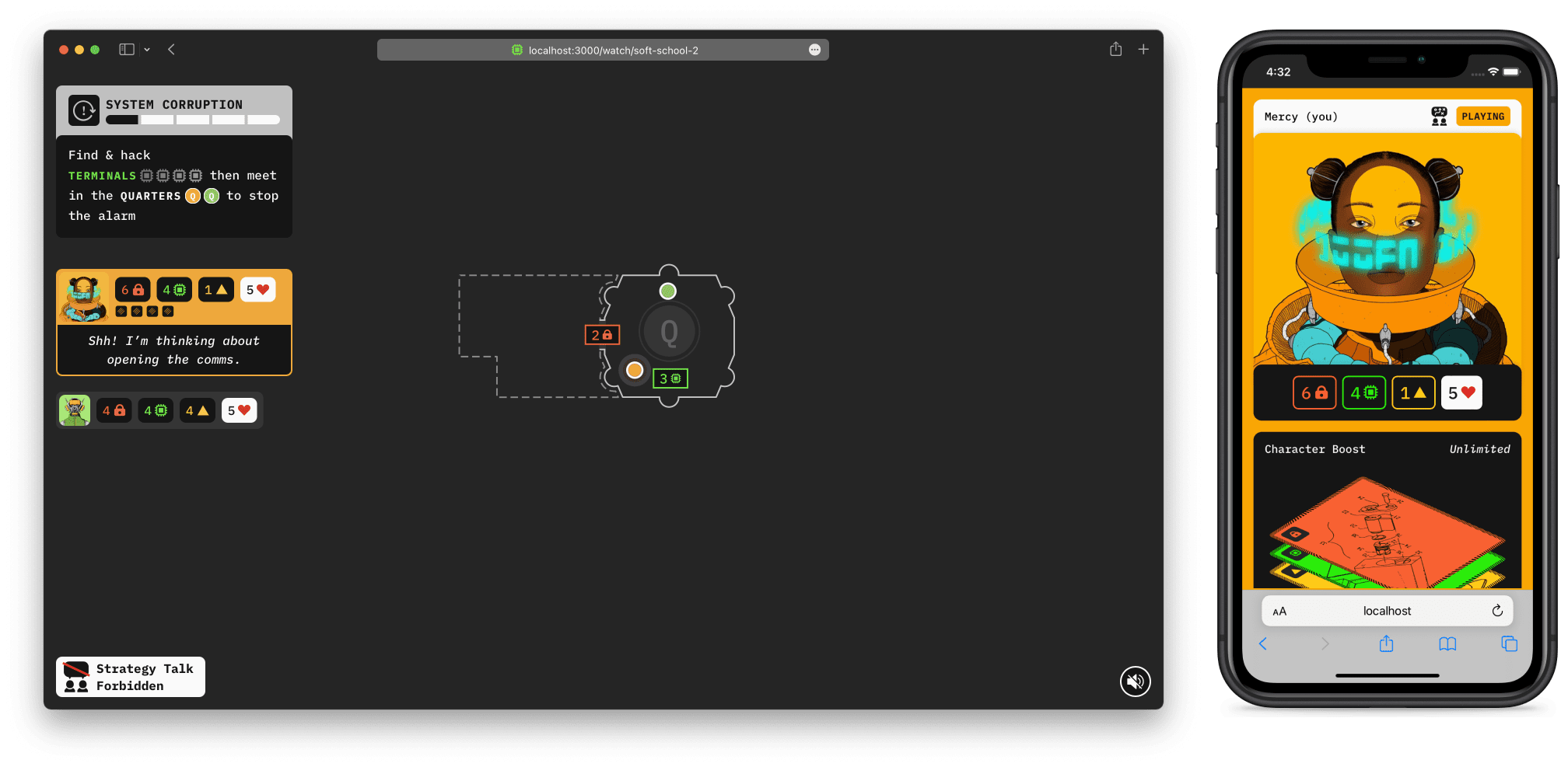
The prototype code is open source so you can run it on your own machine or server
DownloadThis website presents the process of building, testing and evaluating a prototype cooperative game to investigate the concept of remote togetherness with the intention of applying the learnings more generically to any collaborative software. The design and principles of the game were inspired by board games, specifically their physical layout and how they distribute information. We paid close attention to the idea of a collaborative flow between users through a central shared space and its impact on social connection and togetherness.
We start by establishing the context and inspiration for this project in the first section Learning from Board Games and we detail the design of the prototype in the following section Designing & Building a Prototype. We conducted remote user testing on the prototype with potential real users and the results are presented in Testing the Prototype.
Finally, we list our recommendations on designing better collaborative experiences in the last section Remote Interaction Guidelines.
Learning from Board Games
The COVID-19 pandemic demonstrated the need to maintain a social connection when computers increasingly mediate our communication. Individuals experimented with different ways to stay in touch with their friends and family, including weekly video calls, which quickly became tiresome and less regular. It can be hard to chat when nothing much has happened lately or when you don’t feel confident enough to speak up in large group conversations. Additionally, for many people working from home, another video meeting is the last thing they want to do.
A popular option to avoid these issues was to organise quizzes or games. These activities generate conversation; everyone has a turn to speak and do something. Simply put, there is a set of rules which mediate the social interactions between the participants. During in-person meetings, we rely on physical gestures such as body language, but in virtual meetings these cues are much harder to perceive. Using a clear set of rules makes the social flow explicit.
Board games, and more specifically cooperative ones, are also successful in bringing groups together and creating a sense of togetherness. They offer ways for players to immerse themselves in a theme while promoting collaborative problem solving, thus re-creating the feeling of a team working towards a common goal.
With this in mind, the framework of cooperative board games might provide a more human and social dimension to our digital storytelling and participatory experiences. It could also contribute to making remote working and socialising better.
Our research started by analysing the design of popular collaborative board games (including popular titles such as Pandemic, Arkham Horror, The Crew, Mysterium) and various RPGs (such as Shadowrun and Call of Cthulhu) to extract re-usable patterns that will improve participatory experiences.
Board Game Patterns
Analysing the games, we looked for aspects that could enhance social connection and could create an ongoing conversation. Below are a few of the high-level concepts we found.
Episodic & Regular
Many cooperative board games offer a discoverable narrative. Usually, players can dynamically influence what will happen next, but sometimes the story is just delivered in static instalments. Moreover, the story is sometimes divided into episodes. Each episode can be experienced one after the other, allowing you to take breaks in between. This means you can play with your group of friends over multiple sessions at your own pace.
The story keeps the players engaged in suspense and anticipation while pushing them to meet again to discover what’s next. A similar thing can be observed when multiple people tune in to a TV show broadcast each week (as opposed to the series being available all at once): it creates a regular rendez-vous and an occasion to chat after the show.
Asynchronous
Most cooperative board games encourage players to take turns. This allows people to discuss what they want to do without the pressure of time but also makes explicit who is currently in charge. Players make it clear when they’re done and who is next.
The flow allows everyone to express themselves confidently by carving out a space for each individual while maintaining group conversation. However, it can create a problem known as quarterbacking where a single player might instruct everyone else what to do. Fortunately, there’s a variety of ways to counteract it, from entirely silent games to passing around a leader token.
Objective
In cooperative board games, the group is trying to achieve something together. Usually, there is an objective: collect several things or reach several points. It gives purpose to the group, painting the game as a common enemy to be defeated together.
This can be made more exciting by using a countdown. In the spirit of asynchronicity, this is rarely to do with a time limit in real life but rather a threshold within the game. For instance, having to do something before turn three otherwise there will be negative consequences. The countdown creates a sense of urgency, reinforcing the social connection and the idea that the group is in it together.
Roles & Responsibilities
Cooperative tasks set by board games usually require creating a balanced team from a set of asymmetric roles with their own strengths and weaknesses. This has two advantages:
- It forces the group to organise and converse, making it feel like a team where everyone contributes.
- It makes everyone feel useful and included. A well-designed game will require a contribution from the different aspects of each role.
To succeed, the group has to be cohesive and a single player cannot go ahead and do everything. This naturally creates a social feeling within the group as they undertake and complete the tasks together.
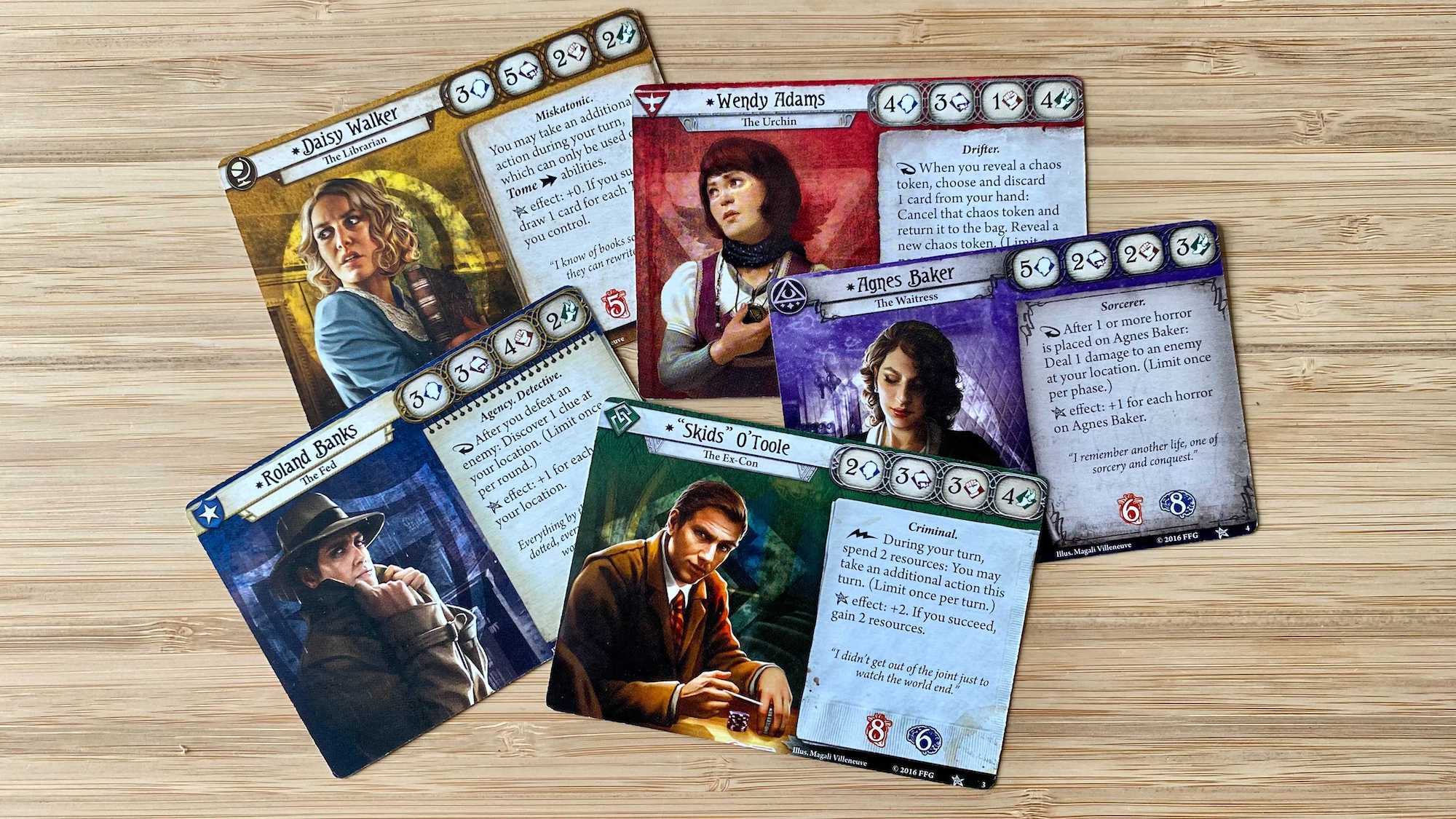
The different characters in Arkham Horror: The Living Card Game showing their different strengths and weaknesses
Communication
To cooperate you need to communicate your intentions and your needs. In most board games, players are encouraged to narrate their actions so that everyone can follow what is happening. This can also include reading additional text provided by the game to give a narrative flavour.
Naturally, any limitation on communication increases the challenge but can also restrain the social aspect of the game by decreasing player interaction. Such a tool should be used carefully because it can dramatically increase the tension but also kill the social connection.
Though the players are usually encouraged to think for themselves, communication with the rest of the group to organise and plan is often necessary. For instance, the current player might submit their plan to the group to get their approval or ask them for additional resources to succeed.
The Board
Board games have four main spaces where information is kept:
- The head contains the player’s intentions and goals
- The hand has the player’s private information
- The board represents all the information that isn’t secret and that everyone in the group can access.
- The rulebook gives meaning to the information on the board and in the hand
In that dynamic, the board is the central shared space between the players that summarises their current and past actions. Everyone contributes to that space with their head and through their hand, changing it as they progress to construct a shared picture. It’s the ultimate representation of the group’s collaboration and what connects them.
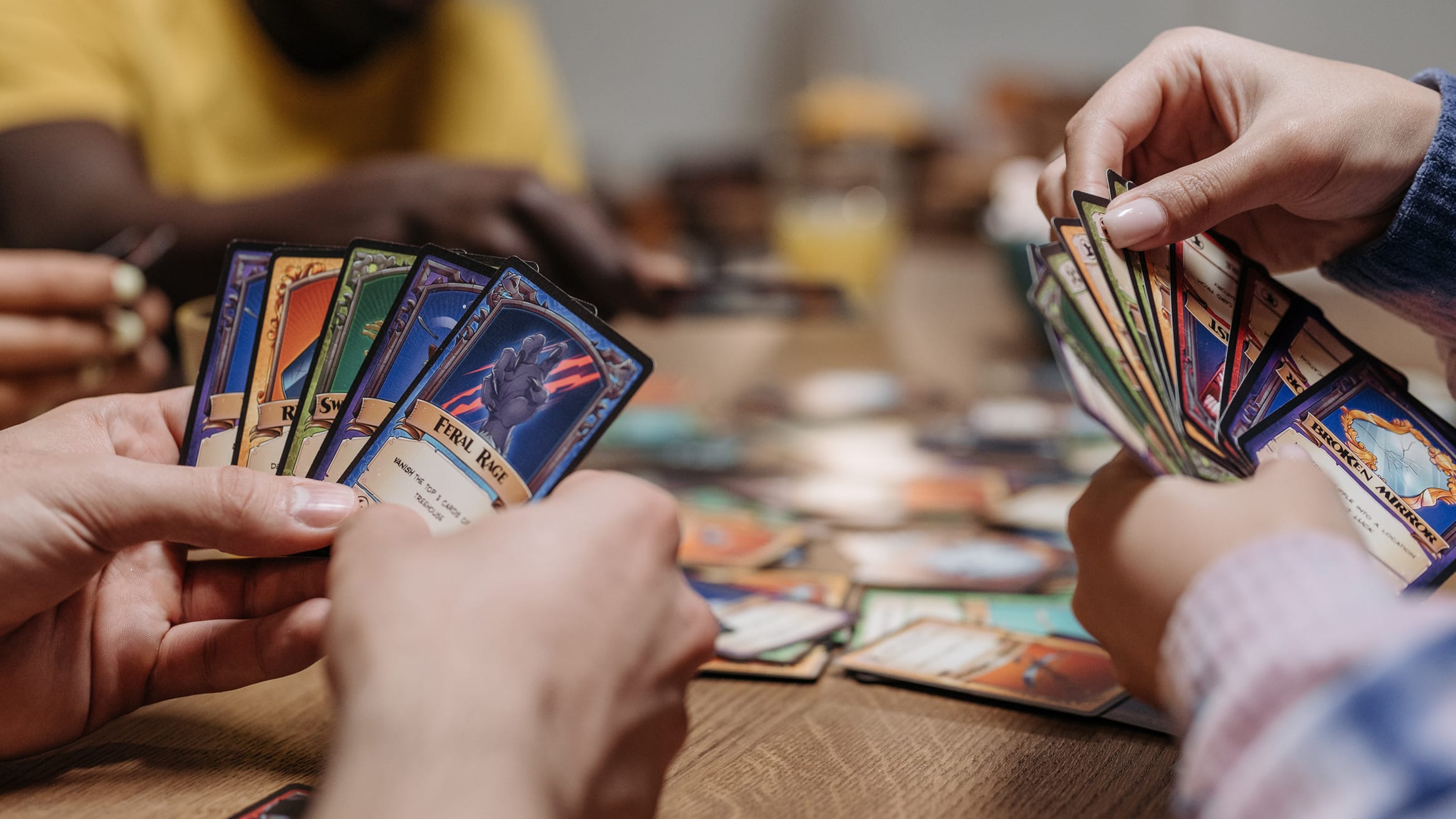
The relationship between the hand and the board
Uncertainty & Discoverability
If you could do anything without risk you would lose the sense of accomplishment. In board games the principle of chance and randomness is often applied to the player’s actions through dice or cards. They rarely succeed automatically, making their achievements more valuable but also keeps the whole group interested in each other’s actions, particularly when it’s not their turn.
Everyone has a vested interest in your success when the task is cooperative. When the outcome of a test is revealed or a new element is discovered, it is shown to everyone at once, creating a shared moment of tension that can result in euphoria or disappointment.
Tactility
While digital applications now power some board games, by and large, the players have to move everything on the board physically. When a player takes an action, they might place a card down, then move a token, pick up some resources and roll the dice. Because the players have to do all of this themselves, it contributes to their understanding of the game but also ensures that their intentions are broken down into smaller steps for the rest of the group.
Unlike digital games, in physical games, nothing happens without you purposefully doing it. Besides the fun aspect of moving pieces of cardboard around, it forces players to decompose their actions, making it clear to the group but also to themselves.
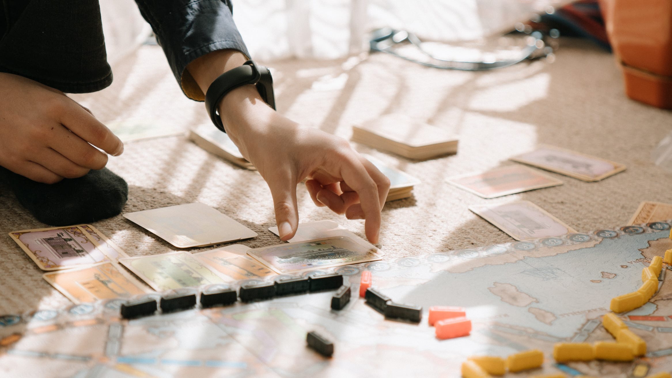
Tactile elements such as tokens, cards and figurines are essential parts of board games
The Hand & The Board
From the start of our investigation, the concept of the board seemed central. It’s a shared space which looks the same to everyone contrasting with current digital experiences where everything tends to be personalised. By its own physical limitations, the board represents the information available to everyone in the same way — there is only one board. If we used a separate screen to create a shared space, we might be able to bring back the positive side-effects the board might have on togetherness.
Having the board as a separate device opens the door to a variety of remote-friendly scenarios. For instance, a couple of players might be in one space and the rest of the players might be distributed. Every physical space only needs one device to represent the board. This also means that the board can easily be shared on a video chat without showing what is private to the player sharing their screen.
We wanted to try this but multi-screen applications come with a few challenges. The main one is attention division — it’s hard to know which screen to look at and when. This is due to a couple of things:
- The content is usually in real-time. You might miss something if you don’t pause, creating FOMO (Fear Of Missing Out).
- The multi-screen features are often added on top of an existing piece of content. That content is rarely designed for multiple devices and must work primarily on a single screen.
Board games seem to indicate that by making the experience more asynchronous, namely turn-based, the players can shift back and forth between the different spaces at their own leisure. We could apply this model to a multi-screen application and hope to see similar benefits. This would allow us to design the board with the same intent as a physical one: representing the past, the present and the future.
The past is represented by the current state of the board. Whatever is on the board has already happened. The present is the result of the current player’s actions. They move a token, or play a card and the board helps you understand the intent of the player. The future is the opportunities available to the players as they read the board in the light of the rules and what is in their hand and in their head.
To test this we decided to build a prototype with an original piece of content specifically designed for use on multiple devices.
Designing & Building a Prototype

The prototype code is open source so you can run it on your own machine or server
DownloadBoard games combine many existing mechanics. It’s the interaction between them that makes each game unique but also allows each mechanic to reveal its full potential. This also makes it harder to understand their effectiveness in isolation. For instance, we wouldn’t be able to test how well the idea of a shared board works if there are no rules for interacting with it. Neither could we look at how a group communicates and collaborates without a challenge for them to face.
For these reasons, we decided to build a high-fidelity prototype game to evaluate the mechanics we chose, designing it specifically to engineer the situations we wanted the players to face. The aim of this prototype was not to make something wholly original in story and gameplay, but rather to research how the tried and tested formulas can help us design better digital social interactions. As a result, the story is derivative of the science-fiction tropes and the gameplay heavily borrows from modern classics of the cooperative board game genre.
Our prototype, Identical, is a narrative turn-based game playable remotely by groups of two to six people. In this game, the players are a crew sent to investigate a mysterious facility only to realise they are facing a series of challenges they will have to overcome together.
Identical leverages all the patterns we wanted to test. First, it has an episodic narrative structure. The game is split into episodes that can be played independently while offering a sense of progression and intrigue to keep everyone engaged. Episodes are broken down into small parts, each with an objective that the group has to accomplish together. Because every player incarnates a different character with its own strengths and weaknesses, each objective is designed to force collaboration to be completed. This naturally creates a lot of conversation which we can subsequently restrict to increase the challenge. The game is not just a puzzle, it also contains elements of discovery, pushing the players to explore, and elements of chance and failure, increasing the tension.
Designing for Togetherness
Similar to physical board games, we wanted a shared public space that all players would look at to collectively decide what to do. This is what we call “the board”. It includes a map composed of rooms that the players have to navigate.
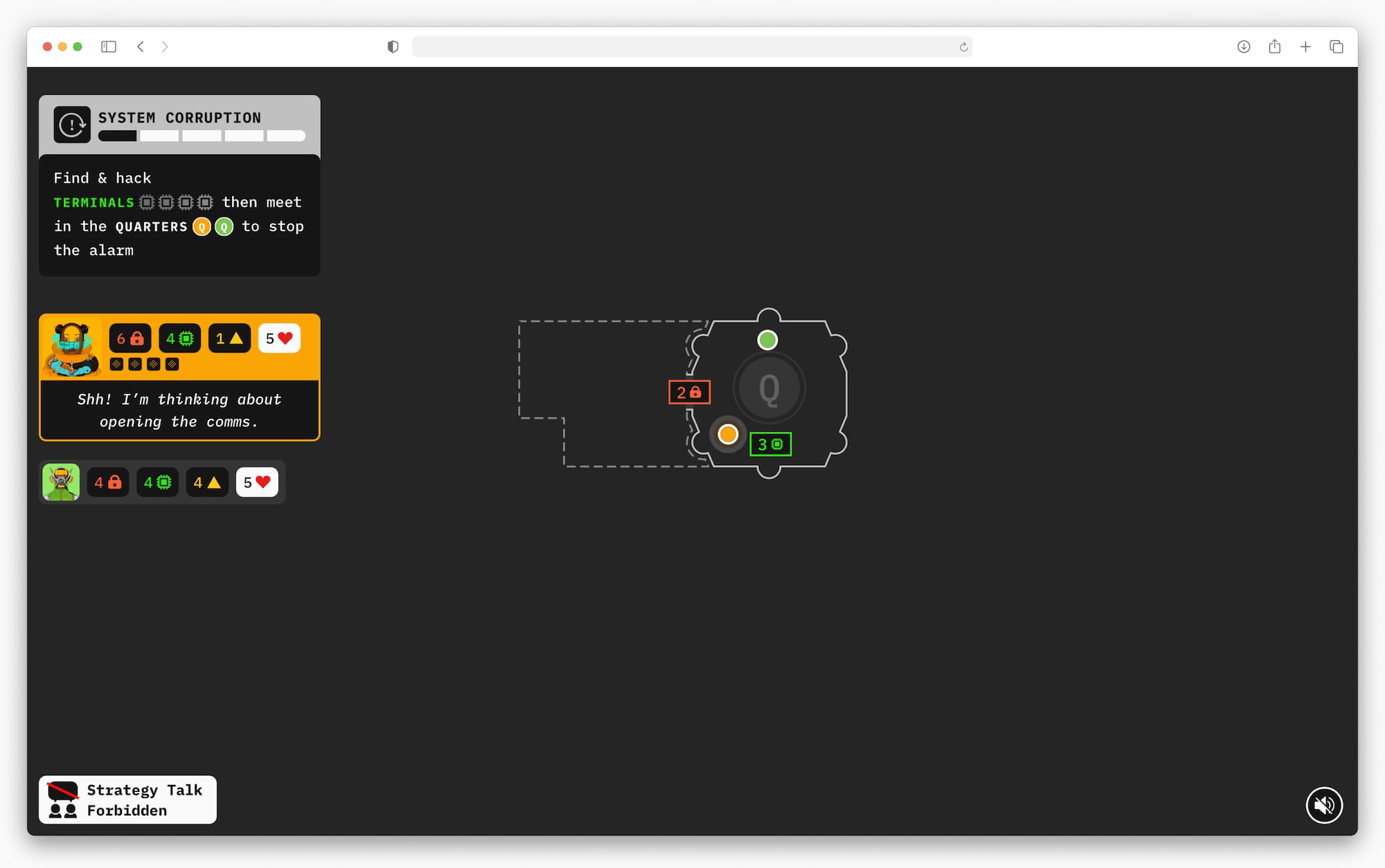
The board is seen by all players and is the same for everyone
In the same spirit, we needed a private space for individual players to work out what they can personally do and for them to interact with the board. We call this “the hand” and it looks like this:

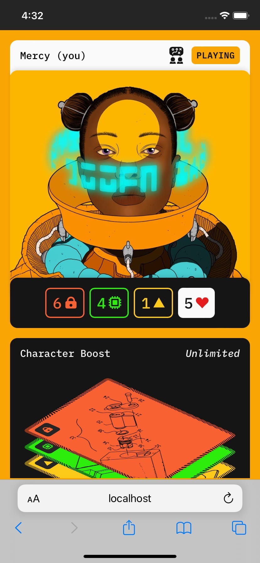
The player screen on a mobile device
Using multiple devices, we can display the board on a big screen (such as a TV or laptop) while each player can use a tablet or smartphone as their hand. Having a separate device for the board means it can be shared by others in the same room but can also be shared via video chat for remote play without divulging any private information.
Setting up a Game
The first thing to do is to set up a session on the device where you will see the board. A player can then scan the QR code from the board to join the game and choose their character. Each character comes with a beautiful illustration by Rob Turpin (@thisnorthernboy) as well as a short story showing their personality, strengths and weaknesses.
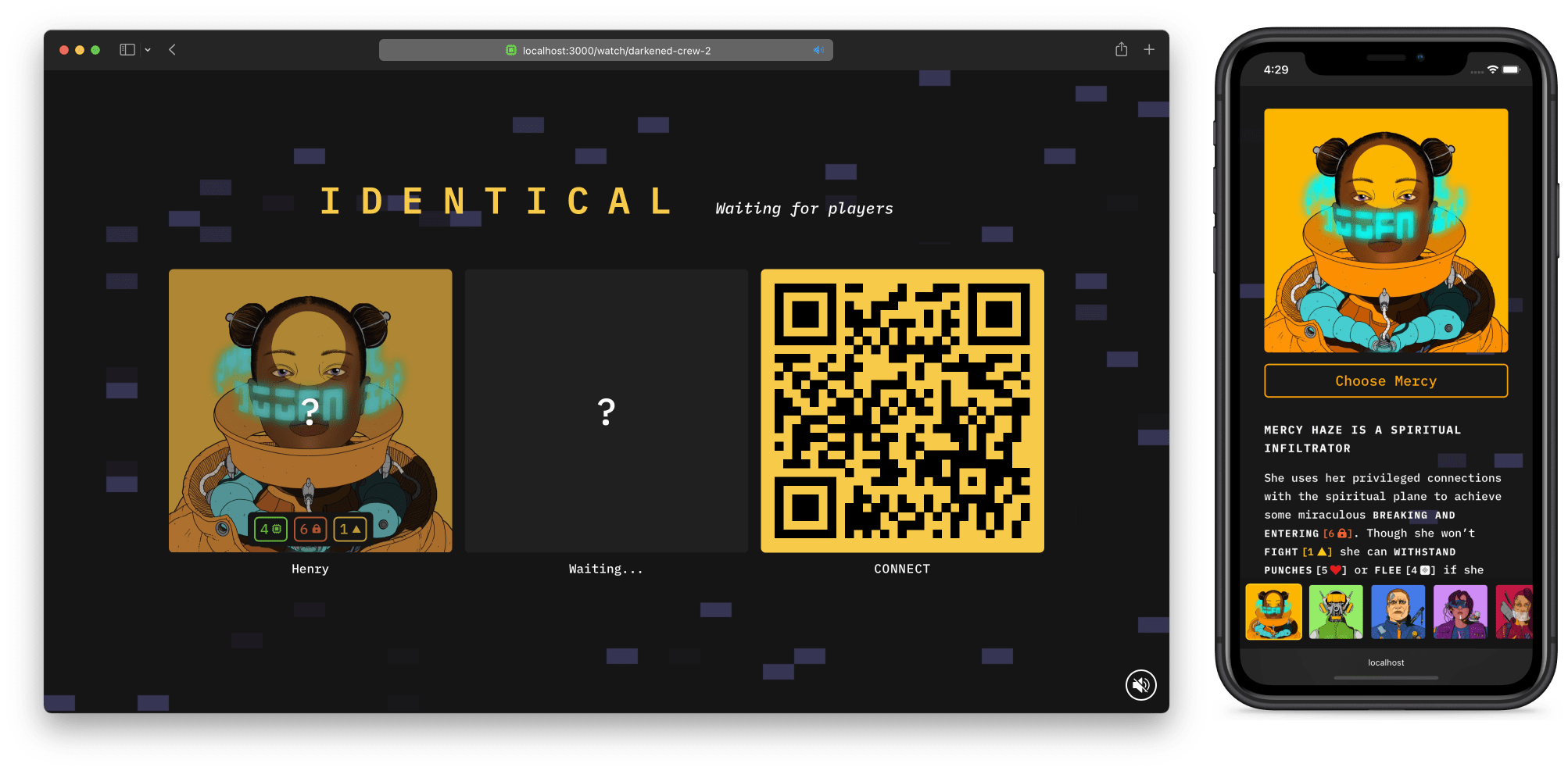
The setup screen showing who has joined and who they have chosen. Can be loaded separately with the URL or shared via video chat. The phone is used to choose a character, showing their backstory and stats
The Narrative
Once everyone has chosen their character, the game starts automatically with a story segment presented in text supplemented by a voice-over to capture the players’ attention.
As we knew the story was likely to change, we chose to use text and a text-to-speech voice so it could be updated easily and automatically generated. The slight robotic overtones also helped with the science-fiction theme of the game.

The introduction to the story appears on the shared screen
Objectives
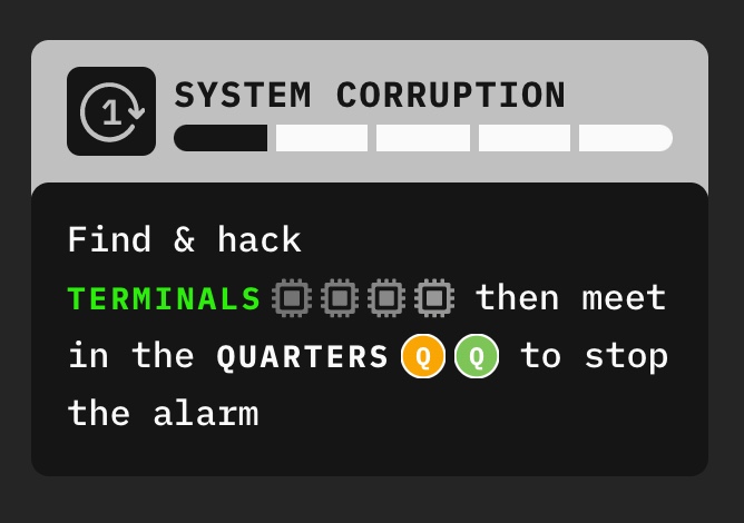
The objective interface showing the players what they have to do
The story always ends with an objective the group needs to complete. This is repeated in clear game terms with icons in the always-visible objective box in the top left of the board. This usually involves a combination of activities: hacking terminals, neutralising enemies, lockpicking doors and meeting in a particular room on the map.
The success of each of these tasks is not guaranteed. The chance of success is based on how good the character is versus how difficult the task is. On the board, the difficulty is displayed on the target. A player can then compare it to their own skill using the matching icon on their character sheet. A difference in their favour indicates a better chance of success.
Randomness
When a player attempts something in a physical game, they might roll a die and then add the result to their skill. If the total is greater or equal to the difficulty of the task, they succeed. In Identical, the die would have 12 sides: -2, -2, -1, -1, -1, 0, 0, 0, 1, 1, automatic failure and automatic success.

Throw one the chips to reveal the number. This replaces rolling dice.
In a digital game, the idea of tapping a button to roll a die might lead to a less tense and immersive moment. You might feel like the game has randomly chosen for you, taking away a sense of agency. By physically rolling a die you have a stronger impression of control over the result and you feel a sense of ownership. When you hit a button, you are disconnected from that moment because the machine is acting for you.
To make the players feel in control, or at least, feel responsible for the outcome we ask the players to choose one card out of 12 presented to them face down. Each card has a value printed on the other side and when they choose — though it is as random as a digital die — they choose which value gets added to their skill. It’s functionally equivalent but gives a very different feeling to the player.
Time Pressure
Another challenge for the players is to complete the objective before the corruption gauge reaches the end otherwise the difficulty will increase in unpredictable ways. The gauge is shown above the objective and advances during the corruption phase which happens after every player has played a turn.

The security check uses a scratch card to keep the suspense longer
During the corruption phase, each player is also subjected to a random check to see if they’ve been spotted by the security system. Much like the die, letting the system randomly decide whether a player has been spotted or not might feel unfair. In a physical game, you might draw a random card from a deck that will decide what happens to you. That moment of picking the card, though you have no control over which is on top, creates a sense of tension and responsibility. Similar to the die, clicking a button to reveal a card might give you the same feeling of being cheated by the computer.
To combat this, we introduced a scratch card with 4 areas, each with a symbol underneath. If you reveal 3 of the same symbols then you will be spotted and suffer the consequences depicted. However, if the symbols don’t match you go unnoticed.
This creates a sense of anticipation while scratching the card, slowly revealing if you’re likely to be in danger or not. Again, this is functionally the same as revealing a digital card, but the physical process of scratching the card disconnects the computer from the outcome, placing the player in the front seat.
The Map
To complete the objective, the players have to use their personal devices to move around the map and interact with the environment. The map is the central reference that the players use to achieve the objective and it shows the same layout to everyone.

A player moving on the board
Discovered rooms have a solid outline and the unexplored ones within reach have a dotted one. You only see what’s in the room by moving into it. Only then will you reveal what’s in the room: a terminal, an enemy or maybe nothing at all. If the room contains an active enemy, the solid outline becomes yellow as a sign of danger: if you finish your turn in the same room as an active enemy you will be spotted.
The players are represented by dots of different colours and the active player is both highlighted in the list on the left and on the map with a pulsing animation.
To navigate from room to room, the players use the actions on their character sheet. But they have to be careful, each player can only do a limited number of actions per turn.
Communicating

Choose if you want to receive external input at the beginning of the turn
The board is made to communicate what the current player is thinking and doing while everyone else is waiting and cannot see what that player is up to on their hand device. This is all the more important because we needed some parts of the game to be played without anybody talking.
One of the most significant issues of collaborative games is a phenomenon called quarterbacking where a single player will take the lead and essentially tells other players what to do. This can be a frustrating experience and we need to make sure everyone can make the decisions they want when they want to and take input from their group when they need to.
We’ve approached this in various ways but the most successful one, both socially and in terms of gameplay, was to let the players choose at the beginning of their turn whether they wanted strategy input from the rest of the group or not. If they chose not to allow other players to butt in, they also receive a small bonus encouraging them to be independent but there’s no penalty for requesting assistance. The player makes their choice visible by playing a card “strategy talk allowed / strategy talk not allowed” at the beginning of their turn and their choice is visible in the bottom left of the board throughout their turn. The rule is only enforced socially rather than functionally.
Shared Reveals
Other players need insights into what the current player is doing, particularly if they’ve chosen not to talk strategy.
First, for each action the player is taking, their character will say something on the left-hand side. This is most useful for actions with multiple steps and where a player might be checking something before doing an action and allows you to track what the player is thinking.
Second, whenever a player is playing a card, for instance, to boost their skills for a task, that card is shown on the board for everyone to follow the action. When a player is attempting a task, the value of the card they’ve chosen is shown to everyone at the same time on the board. That shared reveal creates a moment of togetherness where everyone is hoping for the action to succeed.

Everyone can see the result of the lockpick action on the board
Cross-Screen Interactions & Attention Division
We designed the game to work on separate devices: one for the board and one for the hand. We hoped that having a dedicated device for the board would create a point of focus and increase the sense of presence and togetherness given by the map. In doing so, we were also closer to how a physical board game operates with a central table that everyone contributes to from their hand.
To enhance the feeling of sharing something in a shared space, we designed the cards to be thrown from the hand onto the board. The player could swipe them up out of their device and they would “travel” onto the board making it a more tactile experience.
When the players flick a chip from their phone it appears on the board where everyone can see it. The overlay after the interaction helps to shift their attention to the board.
There is no time limit on playing your turn so players can switch their attention from one device to another at their own pace and nothing happens without them initiating it. However, for the players waiting, their attention might be on their own device rather than the board when the current player is doing something important.
We use audio cues to alert the players but also their hand device will show a blocking overlay saying “something’s happening” and pointing towards the other device, encouraging them to shift their attention.
Testing the Prototype
Methodology
The prototype we tested was an earlier version of the one described above and as such, had a modified design and feature set. Notably, it had an in-game chat system and required participants not to talk for parts of the game.
To understand the effectiveness of the mechanics we built into the prototype in terms of togetherness, we recruited three groups of three participants screened for their interest in board games and science fiction, each with a different location scenario:
- Fully Remote (each participant in a different location)
- Part Remote (two participants in one location and one in another)
- Co-located (all participants in the same location)
Each group played the prototype for at least one hour and was invited to a video call where we could observe and occasionally provide guidance. Each session was split into 3 parts:
- Open Play (microphones are on and allowing audio chat)
- Silent Play (microphones are off and conversation can only happen through the in-game chat system)
- Another segment of Open Play
Following this session, we ran 45-minute interviews with each of the participants individually.
Analysis
What worked?
Overall, the prototype was very well received. The story and the gameplay maintained the participants’ interest and created intrigue, even though it borrows from established tropes and mechanics. The participants expressed a strong desire to play again as a group thanks to the episodic delivery. The sessions were seen as social occasions, creating conversation during and after the game.
The collaborative experience was seen as more relaxing and inclusive than the more usual competitive games. The idea of the shared goal was appreciated and resulted in participants being invested in each other’s moves, making them root for each other and creating a team feeling. Ultimately, everyone appreciated having a different role allowing them to feel like a valued part of the group. Generally speaking, the character skills and how they related to the tasks in the story were well understood allowing them to strategise collectively.
Really enjoyed playing the game, almost a bit more than expected, got into it quickly and became quite immersed in it
The prototype’s features with elements of discovery and chance were the most praised. For example, entering a new room will reveal its contents and this was described as a driver for exploration and furthering the story. This, together with skill tests and scratching cards promoted team building by revealing the result to all players at the same time. Some participants noted they wanted to help their teammates succeed and watched intently when a random outcome was happening, sometimes feeling a sense of responsibility.
We were all waiting for the number to pop up and be revealed. Every time we lost we would all be quite disappointed and quite excited when it worked.
The multi-device setup was seen as unique and interesting. It added novelty but also recreated some of the positive feelings found in playing a physical board game. Specifically, having the board as a shared space with collective information, enhanced by cross-screen interactions, promoted presence and togetherness. It was seen as an essential part of the game and communicated effectively what participants were thinking and doing, helping everyone feel involved. Some players went as far as saying they felt like they were in the same room. Cross-screen interactions were seen as an improvement on just pushing a button as it was perceived as more exciting and promoting connectedness by making use of the board.
Very exciting to see the card flicked appear on the big screen. I felt very much connected to the big screen, really liked that aspect of it.
We did not observe any issues of attention division thanks to the asynchronous nature of the prototype and our design cues directing the participants’ attention. The clear design and colour-coding of the interface invited exploration and allowed for comfortable play without a tutorial.
What didn’t work?
We observed, and some participants acknowledged, that there’s a tendency for a player to place themselves as a leader, directing all the other players and telling them what to do. This is known as quarterbacking. We’ve noticed that this phenomenon was most prevalent among men in our sample group. Combatting this with the periods of silent play were not wholly successful even if the players who enjoyed them noted it made the game more immersive.
We observed players who had been told what to do previously would perform better in terms of gameplay when the mics were off and they were free to make their own decisions. But when these players were given control, they sometimes expressed anxiety about having the responsibility to make the right choices for the team. They also mentioned they appreciated having time to work things out independently rather than someone giving them the solution. However, it was clear nobody would prefer to play a whole game with the mics off to gain independence. Ultimately, silent play was seen as going against the social aspect, negating the positive impact it had on quarterbacking and focus.
Having a limited chat, everyone would have more of a chance to make their own decision.
To better distribute control, we created an in-game chat system where players cannot start a conversation when it’s not their turn and instead have to send a chat request. On their turn they can send a single message and the other players can reply once. Though it did achieve its intended goal when it was understood, it was seen as too frustrating and the UI of the chat did not perform well as users were expecting established patterns.
Couldn’t reply on time. It wasn’t like a normal chat, I had to wait or something like that and I found that confusing.
The interface had some visual hierarchy issues which made some elements easy to ignore or hard to understand. Notably, the corruption progress gauge was more mysterious than intended and too easy to ignore while its effects were unclear. Similarly, the design of the objective was not conducive to keeping it front of mind as required by the game. We also noted that the desire to explore the map was often distracting from the objective.
We noticed that the positioning of help text or buttons towards the bottom of the screen tended to be ignored more easily. This was particularly true for the button to request a boost which was only spotted by a fraction of participants. They were aware of the feature but could not find how to do it intuitively or remember where they had seen it.
Most participants understood they were flicking a card from their phone to the board, however, there were some issues with players not referring back to the board thus missing the animation. This was mainly observed when all players were in the same location or not facing the screen directly.
Improving the Prototype
Since the user testing, we’ve improved the prototype based on the feedback we received. The final version is the one described in the previous section while below we’ll focus on the key changes we made since the test version.
We observed that playing silently was simply an understanding between the players and there’s no way to enforce it so we stopped silent play and removed the in-game chat. Instead, we devised a new system where they can choose whether they want external input or not on a turn-by-turn basis to keep the benefits linked to the reduction in quarterbacking as well as making sure the players are comfortable being in the front seat.
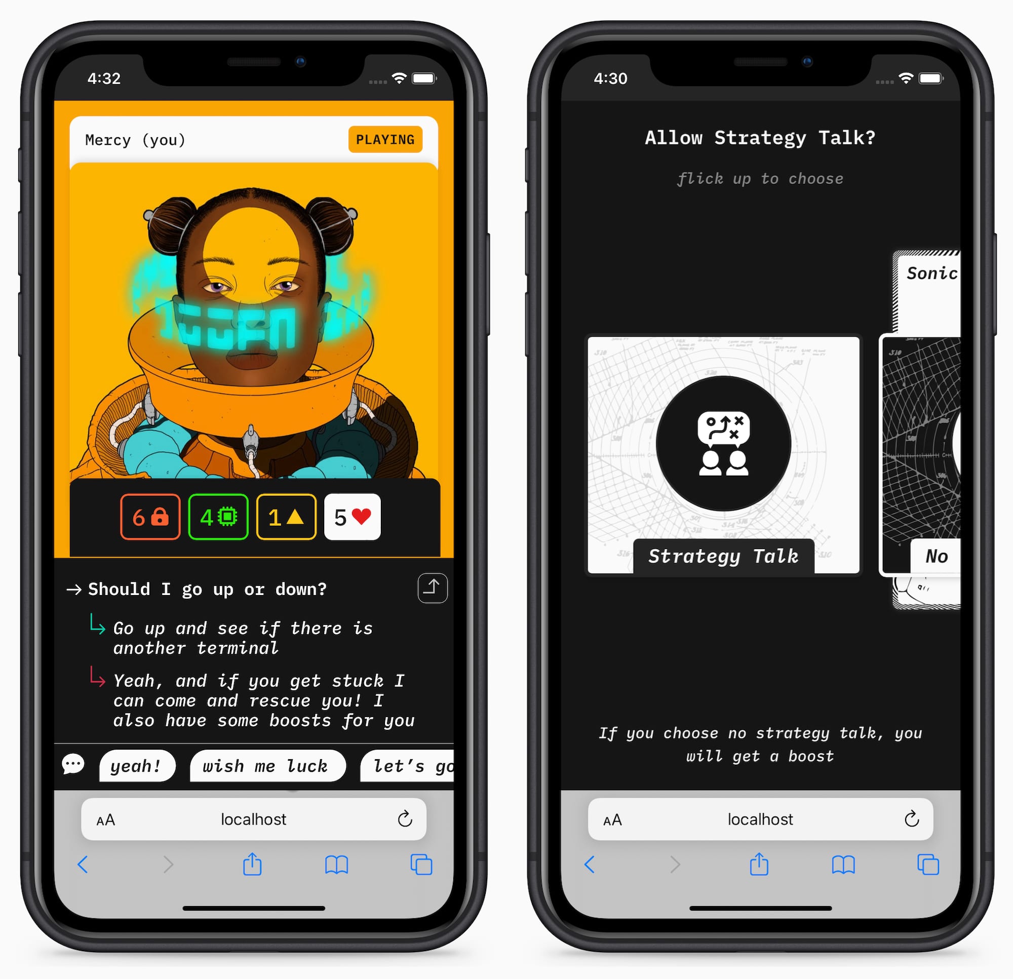
Left: the built-in chat system used during the silent play. Right: the new comms interface.
This means players can always chat but cannot receive unsolicited advice. Anyone can tag along and relax into the collaborative experience or come up with their strategy when they want to. As we did observe better play when players weren’t directed, we encourage them to be independent by offering them a bonus if choose not to receive external input.
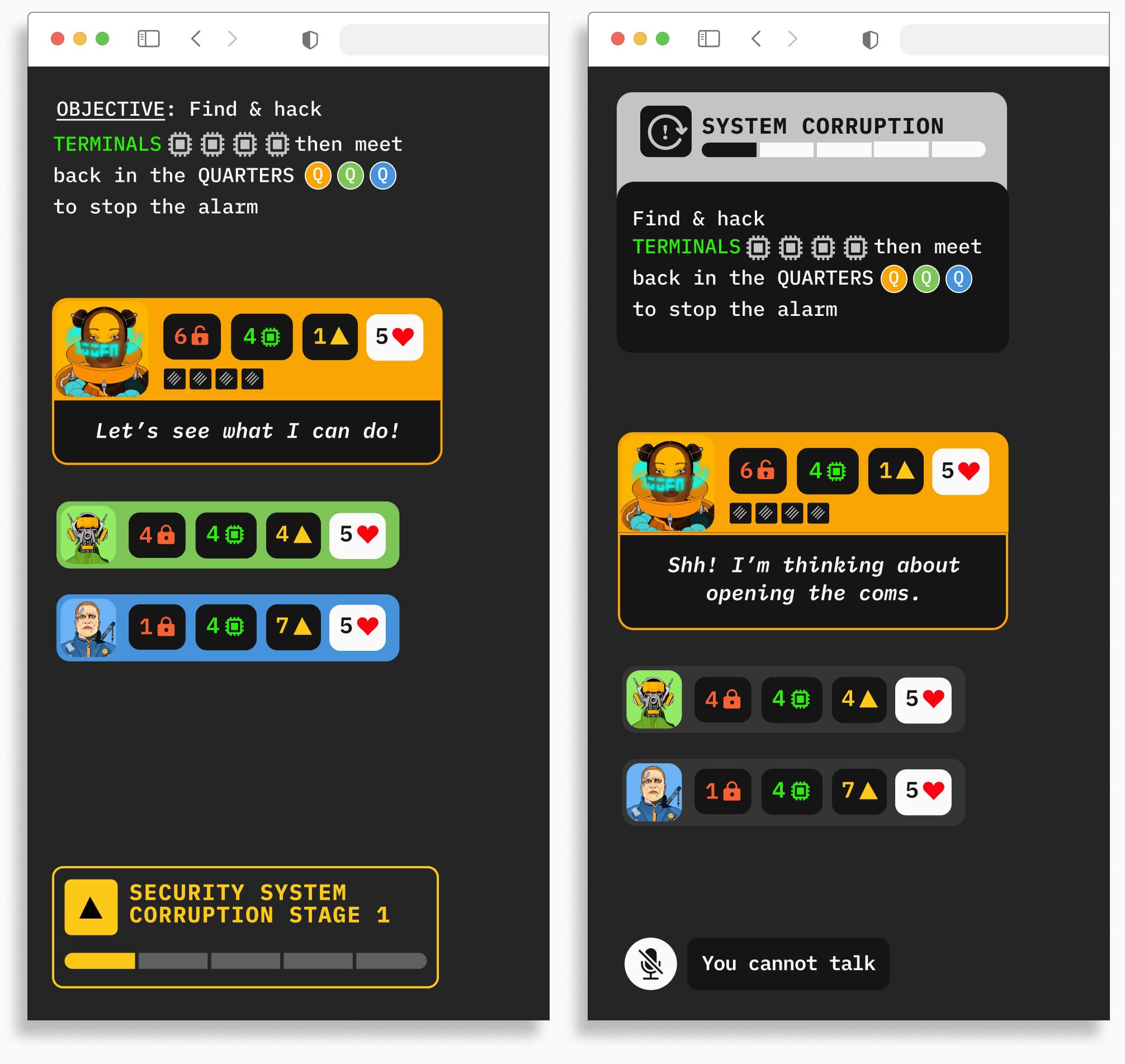
Left: previous design of objective and corruption. Right: new unified design.
We also redesigned the parts of the UI causing confusion. Notably, we tried to make the relationship between the corruption gauge and objective clearer. Initially, these elements were at opposite ends of the screen and we’ve now brought them together and given them more focus and prominence. We also changed the colour-coding of the corruption gauge which was previously strongly linked to enemies and led to misunderstandings. We further reduced the focus on the non-active players to emphasise the active player. We redesigned the boost request, making it a separate action rather than an option within an existing action and took that opportunity to make it a cross-screen interaction to give it the feel of a collaborative feature.
Remote Interaction Guidelines
Throughout our research, we observed that we needed three components to create a positive collaborative environment: togetherness, social connection and engagement.
We define togetherness as the feeling of being part of the group and sensing other people’s presence. Social connection revolves around communication and feeling valued and useful as part of the group. Engagement is necessary to make sure everyone is focused and putting the same level of effort into the goal.
As a result, the guidelines are split into three sections reflecting these major principles. Each section also has Optional patterns which were seen as non-essential but had additional benefits. Importantly, the guidelines do not prescribe any visual or thematic representation and rather focus on the underlying interaction design and rationale.
We found these patterns apply to all types of multi-user experiences and we later include examples of their application outside of games.
Togetherness
Use a single shared space where everyone can contribute to establishing a sense of presence and togetherness. Seeing other participants creates presence and seeing the same information creates togetherness.

See everyone at once
It’s crucial to let everyone know who is currently in control and to display their intents and thoughts as the well as the outcome of their actions. This keeps the group interested and together when they’re not active and helps bridge the remote gap by sharing the thinking process while creating excitement and anticipation.

Clearly show what people want to do and the result of it
Optional
Use a dedicated screen to reinforce the central and shared aspect of the common information. Use an individual device per user to give a stronger sense of privacy and independence.
The multi-screen setup allows the use cross-screen interactions which make the experience more tactile and fun. To deal with the attention division resulting from the use of multiple devices, it’s best to make the experience asynchronous and turn-based. You still need additional cues to attract and direct users’ attention when something important is happening.
Social Connection

Profiles with different strengths
Use a common goal and different roles to create purpose and social connection. Different roles, each with its own strengths, will force the group to collaborate in order to succeed, making them feel like a team. This naturally creates conversation while making individuals feel like useful and valued members of the group.

The team faces a common challenge and has to work together to succeed
To avoid someone taking over, it’s necessary to put in place communication rules promoting independence and autonomy. However, it’s important this is not bestowed on the user, instead they should be able to make a choice and opt-in for more autonomy.
This preserves the social connection and encourages users to ask for help if needed. These limitations should be enforced socially rather than functionally to avoid any frustration.
Optional
To further encourage autonomy, you can add rewards for not communicating. These rewards can take the shape of small temporary enhancements to the user’s abilities so they can work independently if needed. The rewards need to empower the user to make their own decisions, making them more invested in the team even though they can’t communicate.
Another way to enable social connection is to formalise the idea of requesting and offering help. It makes people feel useful and valued when they can help and avoids frustration when someone feels stuck. For instance, allowing to trade temporary enhancements can further encourage the group to work as a team.
Engagement
Use an underlying narrative to break down the collective goal into smaller objectives and increase immersion. Display their progress and use mechanics of chance and discovery to keep the participants engaged.

Show the progress in the story
For instance, ensuring success is never automatic (but non-random) keeps the group interested in their collective success, making them invested in each other’s actions.
Similarly, making part of the shared space discoverable creates a sense of mystery and a desire to explore and progress. However, exploring can be too alluring and distract the users from the goal.

Time limits for tension and focus
Optional
Make the objectives time or turn-limited to create urgency and keep the group focused on the task.
Additionally, designing each part of the story as distinct episodes running into each other will encourage the group to play again and more regularly.
Evaluating the Guidelines
The guidelines outline patterns and recommendations that anyone can use to enhance participatory experiences for groups. However, knowing that these insights initially come from a board game perspective, we wanted to see how well they would extend beyond that paradigm.
Looking at our recommendations, we felt that extending much further might cause issues. For instance, the ideas of randomness and failures didn’t seem particularly productivity friendly (who’d want to use a version of Word where the documents only save if you roll the right thing on a die?!).
So to help us better understand how collaborative apps are currently designed, we looked at six existing applications:
- FigJam (shared whiteboard)
- Google Docs (shared document)
- Zoom (shared call)
- Slack (shared chat)
- Mozilla Hubs (shared 3D space)
- BBC Together (shared video)
We proceeded to rate each feature against what we recommend in the guidelines.
Broadly, we found most of the guidelines represented in these applications but some parts were consistently not there. For instance, all of them had a shared space that everyone could access, but none enforced our key principle to show the whole of the shared space to everyone at once, making sure that everyone has the same view. We noticed the same thing with roles: some apps had different roles but they were rarely designed to be complementary and therefore less likely to create the social feeling that the guidelines works towards.
This might be because they are pure productivity applications and users need to be able to work independently so they can’t always see the same thing or be restricted to a subset of what they could otherwise do. However, we think this makes it detrimental to our measured metrics of togetherness and social connection.
Applying the Guidelines Outside of Games
Based on our evaluation, we needed to test whether these guidelines could be applied successfully outside of games as some of the recommendations might not be adapted. For example, showing the whole of the shared space to everyone might be impossible in some cases.
To better explore how our guidelines stretched into the real world, we selected three parameters:
- The size of the group (small to large)
- The purpose (productivity, creativity or entertainment)
- The synchronicity (from real-time to asynchronous)
Our high-fidelity prototype is a game (entertainment) that’s turn-based (semi-asynchronous) and works for groups of two to six people (small).
In an effort to cover more of each axis, we decided to design three more applications:
- Writers’ Room, a productivity application for small groups that can be used asynchronously or real-time
- Studio Session, a real-time creative application for small groups
- Colab, a semi-synchronous productivity application for large groups
We hoped that by challenging our guidelines with these briefs, we would better understand the limitations of our recommendations.
Writers’ Room
A collaborative writing tool making use of roles but also enforcing the identical view of the shared board.
In collaborative writing applications, the document is the shared space and everyone can scroll their own view of it. The guidelines recommend a shared view, which is an issue if someone is working on the beginning of the document while someone else wants to read the end.
The intention of the recommendation is to make sure that you can always see what other people are up to and never isolated to increase the feeling of presence and togetherness. To do this, we came up with a solution using split screens.
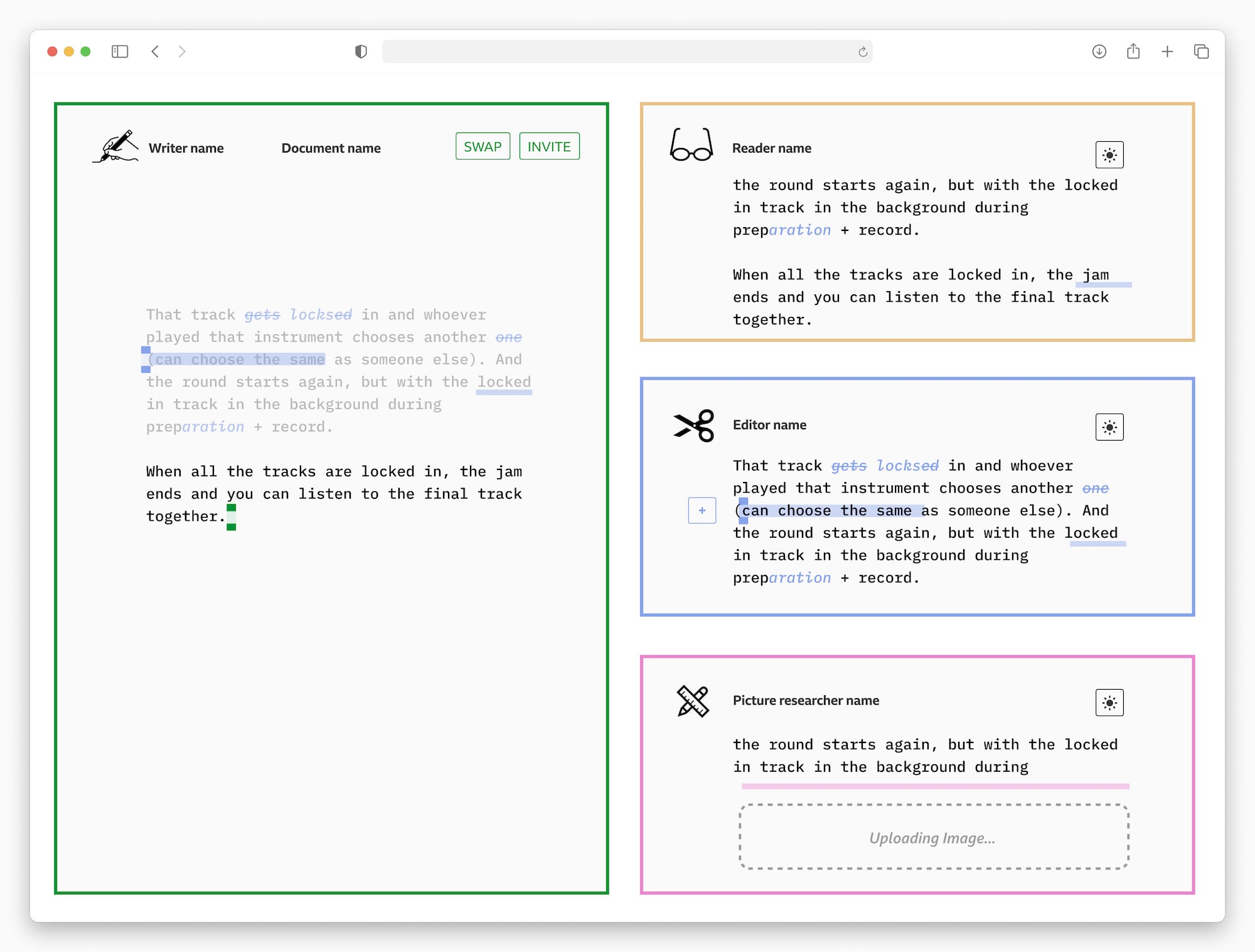
Set of wireframes demonstrating how we applied the guidelines to this idea
DownloadOn the left you have your own view of the document which you can scroll at your own leisure, and on the right you have a small window for each of the contributors, allowing you to see where they are in the document and what they’re doing/writing/highlighting. We also suggest to be able to dim the right-hand side of the screen for increased focus.
You don’t have to spend any time looking for a coloured cursor in a document and neither do you have to click on someone’s name to see where they are. You see it immediately, which is effectively what the guidelines want to achieve.
We also introduce defined roles a user can choose when they join the document:
- The writer can write but not edit
- The editor can make edits and suggestions but they have to be validated by a writer
- The picture editor can add external resources (images, videos, links, etc.)
- The reader can read and scroll around
Even in Google Docs, rarely do people write the same paragraph together. Teams tend to work on different parts of the document and if they're chatting in real-time they’re more likely to have someone write and others edit. With these roles the team comes together to shape the document, each doing a meaningful part.
Studio Session
A music application for a group of friends to jam together remotely.
A creative application sits in between entertainment — where there is no output — and productivity — where the output is the goal. Everyone is working on an output but the important part is what is discovered during the process.
We leveraged the recommendation of a common goal explicitly by offering a choice between three jam options for the group to select. The roles are naturally defined as everyone chooses a different instrument and therefore contributes something unique.
The concept is to let everyone warm-up at the same time for a minute and then get the band to record 30 seconds individually, without hearing anyone else. Then the recorded tracks are played one by one and everyone votes on whether they like it or not. The part with the most votes will appear as backing in subsequent warmups and recordings. If the band can’t decide on the best track by voting, it’s either discarded or randomly chosen if there’s a tie (which works towards the engagement as per the guidelines). The votes encourage social connection and communication.
The person who had their track selected changes instrument and the process is repeated as many times as there are players. The final output is a combination of all the best tracks that have been voted.
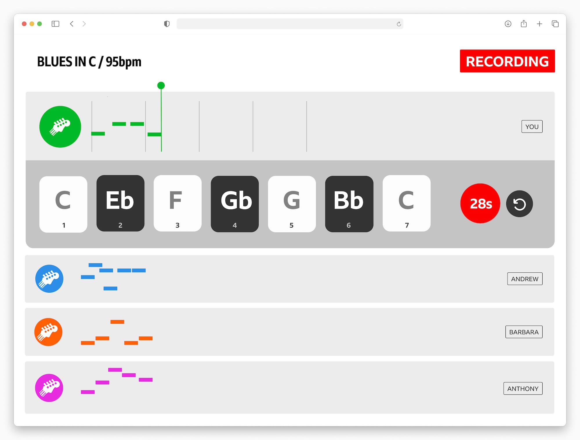
Set of wireframes demonstrating how we applied the guidelines to this idea
DownloadThe shared space is effectively the sum of all the individual chosen tracks and as you record you can also see (but not hear) the outcome of the other players’ actions as recommended by the guidelines for togetherness.
Colab
A communication tool to stay connected with a remote team while allowing focused work in small groups
The main challenge for a remote team communication tool was to design it so an average team (~30 people) could feel more together even though they’re interacting asynchronously.
We spotted a few issues with existing tools:
- Asynchronous written communication, such as Slack, can create anxiety because it creates a permanent record and there isn’t a good understanding of who will read it. This can be particularly difficult for new joiners.
- There is no sense of shared experience or shared history between groups inside a team. Because they don’t share a physical space anymore, we lose low-noise signals of belonging to a team.
- Manually sharing your work activity is time-consuming and doing it automatically has deep privacy implications.
As a response, we imagined a space composed of a finite number of rooms. Each room contains a shared whiteboard and shows active meetings in colour, allowing anyone to get an overview of the general activity. Every dot is someone’s cursor moving in real-time around the space, emitting little waves when they’re talking (you can’t hear them but you can see it). You can also see when a reaction or emoji is used but everything else on the whiteboard is behind frosted glass. This gives you a rough idea of how a group is getting on without infringing on anyone’s privacy.
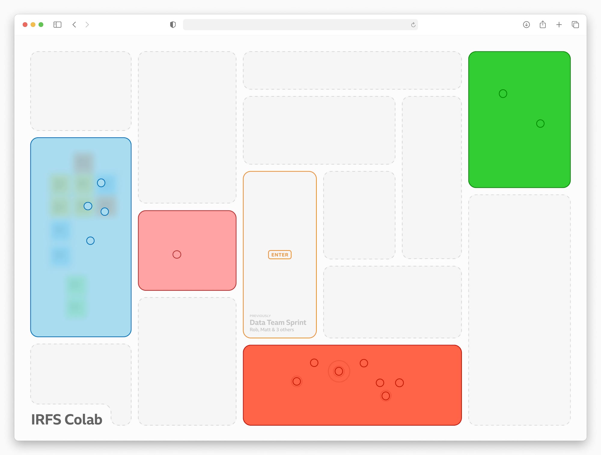
Set of wireframes demonstrating how we applied the guidelines to this idea
DownloadThe whiteboards inside the rooms are much like FigJam or Miro but there’s no zooming or scrolling, the whole board is visible all the time. For that reason, we encourage people to create and delete things as they go, continuously using the canvas as a way to illustrate and organise their thoughts. The text conversations in each room are ephemeral allowing for quick chats, decisions, and questions without interfering with the ongoing work. You can also save anything your team creates to your private area and bring them back whenever you need.
The whiteboards and their content exist whether there’s a meeting active or not. When the group leaves the room, whatever is left on the whiteboard will stay there until it’s deleted by someone in the room. When a room is empty, you can see who was there before and the topic of their meeting.
Ultimately, by introducing re-usable spaces that not only leak abstracted activity but also retain traces of the past we build up a sense of space and history. You organically encounter the activity of your team the same way you would in an office, catching a glimpse of a screen or a small conversation just by using the software.
Conclusion
In a future where distributed teams are the norm and people are scattered but yearning for closeness, we hope these recommendations can help to bridge the remote gap.
Board games offered us a great perspective on group collaboration, allowing for increased togetherness, social connection and engagement. The physical separation of information in four spaces gave us some great insight into how we can model our thinking about software interfaces:
- The head represents our intention, i.e. our objective, what we want to do
- The hand represents the tools available to us, i.e. what we can use to interact with the world
- The board represents the situation we’re facing, i.e. a user interface
- The rules represent how to transform your intention through the tools onto the board
That parallel offered us the opportunity to design differently by clearly separating what everyone has access to and what is private, what is information and what is interactive. The design of the central shared space is what brings the users closer together while the hand and the head allow them to be autonomous and feel valued.
The patterns we tested have shown they can stretch beyond the realm of pure entertainment while providing the same benefits. However, we felt that we hit the limitations of the board game paradigm when it came to larger groups. Though there are plenty of games designed for large groups, it seems that the core idea of the board really shines for smaller groups and focused tasks. Even in our attempt to cater to large groups we largely relied on splitting up the space so we could deal with smaller groups rather than 30 people at once. This will be the subject of further research.
Another important thing is that in all of our prototypes we leverage existing social structures such as families and groups of friends or work teams. We expect all users to have some pre-existing social relationship (friends, colleagues, family, etc.) which helps to facilitate conflict resolution and to follow social rules (such as not talking).
We’re looking forward to seeing other people use these guidelines to design experiences that will create a stronger social connection between their users.

The prototype code is open source so you can run it on your own machine or server
DownloadFurther Reading
We continued this project by building and testing Colab. You can read more about it in What can offices teach us about asynchronous large groups?
Acknowledgments
Thank you to everyone who took part in this research, particularly to those who reviewed this paper, took part in the playtesting and provided invaluable feedback and support: Florian Bœuf, Dr Elsa Call, Dr Maxime Courcelle, Sébastien Gatty, Dr Alana Laing and Dr Cécile Triay.
