Introduction
The Remote Interaction Guidelines (RIG) were developed from patterns found in board games and we found that they were particularly well suited to small groups (~6 people) that work synchronously or semi-synchronously (that is at the same time but maybe not concurrently). In our previous research we also designed an application for large asynchronous groups (~60 people who don't occupy the same space as the same time) using the same guidelines to test their adaptability.
We've now built a prototype called Colab based on this previous design and tested it with teams inside the BBC. Here, we look at the research goals and challenges, as well as the building of the prototype and its testing. Finally, we detail the insights we gleaned and our takeaways.
The prototype code is open source so you can run it on your own machine or server
DownloadResearch Goals
Challenges
We found that the principal challenge with designing applications seeking to increase togetherness and social connection for large asynchronous groups is making users aware that other people are around and active when they’re not in the same place at the same time.
Specifically, we want users to feel connected to others in their team even if they don’t work or talk with them on a regular basis.
To do this in RIG, our first principle is to have a single shared space where you can see everyone and what they’re doing. Unfortunately this breaks down when working asynchronously on top of being difficult to do at scale.
However, we noticed that large teams work asynchronously in offices all the time. The people naturally cross paths even if they’re not on the same team and get clues that things have happened in their absence by noticing physical changes in the environment (whiteboard wiped or scribbled on, papers on a desk, post it notes on the wall, etc.). It seemed that organic behaviour and past actions were good mechanisms to successfuly link large asynchronous groups.
By contrast, most digital applications focus only on the present. A zoom call exists only for the duration of the call. Whether you’re in one call or another, it makes no difference. Repeated use of the same space doesn’t make any difference either. Whiteboard applications and collaborative documents naturally benefit from their users working together on something, which means that they can be made aware of other users asynchronously if they make some visible changes (e.g. someone changed the colours or the size of things). However, some of these changes can be much more subtle and easy to miss (e.g. deleting a comma) and tools like tracked changes are often hidden.
To adapt our first principle to asynchronous large groups, we decided to take a cue from the real world and add a time dimension. Past activity should be as visible as current activity and using the application should emphasise changes made in your absence. Users will now not only share a space, they will share a space in time. We call this shared history (in addition to shared space).
To implement this concept of shared history, we needed to increase the transparency of everyone's activity so it could be made visible live or later. This creates the additional challenge of setting the right level of activity broadcasting and recording to preserve the users’ privacy, making sure they don’t feel like they’re being watched.
Hypothesis & Questions
We designed and built our prototype based on this hypothesis:
Combining shared space and shared history can help increase togetherness and social connection for large asynchronous groups.
Specifically, we designed the testing to answer a few research questions:
- Can the RIG principles be adapted to successfully create togetherness and social connection for large asynchronous groups?
- Does shared history create a sense of activity and increase presence of others asynchronously?
- Does the increase in transparency impact privacy?
Prototype
For this project, we built a prototype based on the Colab design from our previous research. Colab is a shared working space for remote teams revolving around a set of fixed rooms with collaborative whiteboards. Its main feature is a global overview of everyone’s workspaces where each workspace is re-usable and records past activities for future users.
Design
Colab is composed of different rooms. A room is an audio-enabled collaborative whiteboard with a limited set of tools for creative sessions such as sticky notes and text blocks. By design, we chose not to include video as we wanted to see if audio-only would make it easier to contribute to the conversation.
We also included two new tools for collaboration: threads and beacons. Threads are a way for users to have ephemeral conversations with each message disappearing after a short time. They were designed so users could have parallel conversations without interrupting on-going vocal conversations. Beacons are meant to attract attention to a particular place on the board by showing a temporary visual alert.
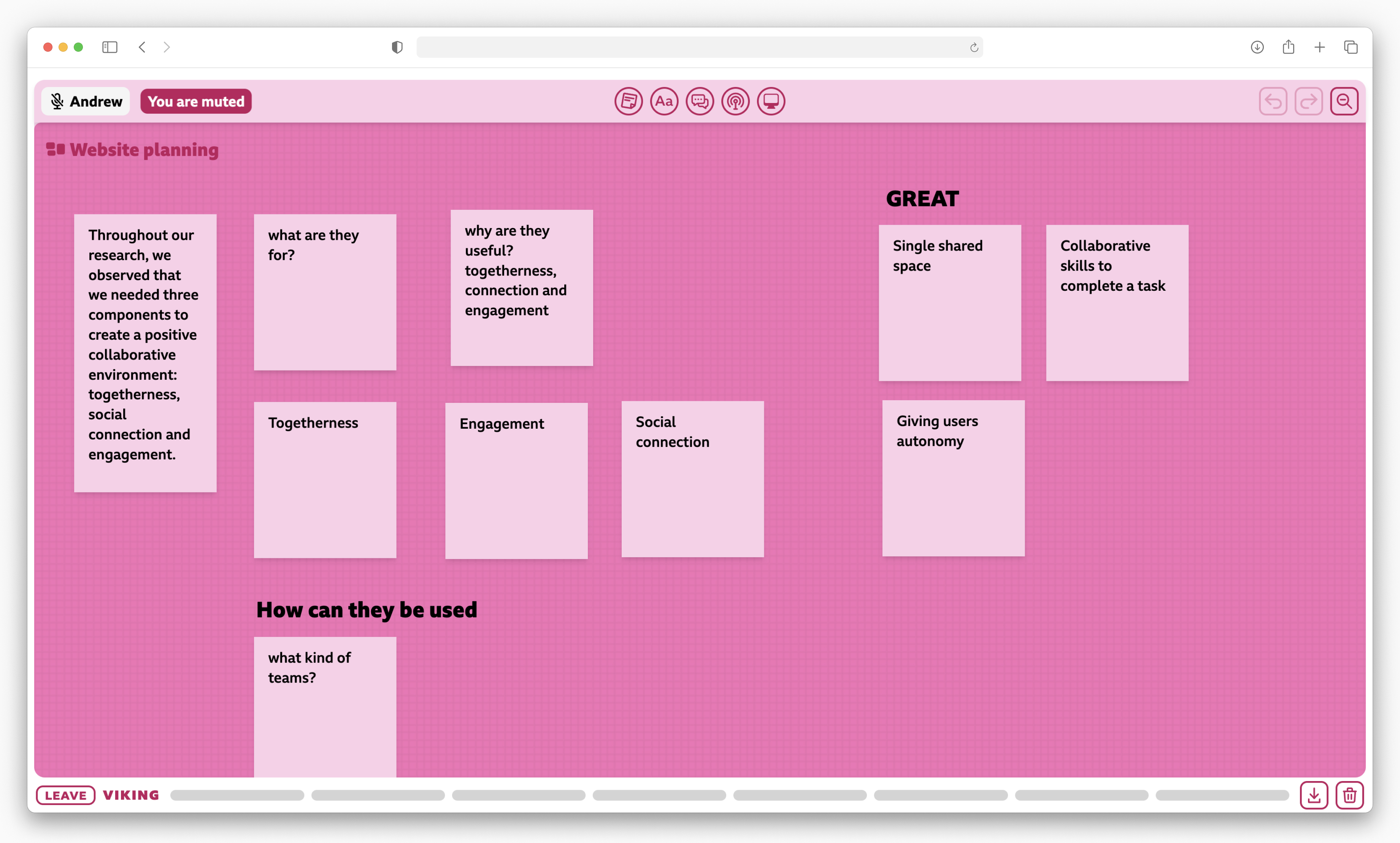
This is what a room looks like with the tools at the top
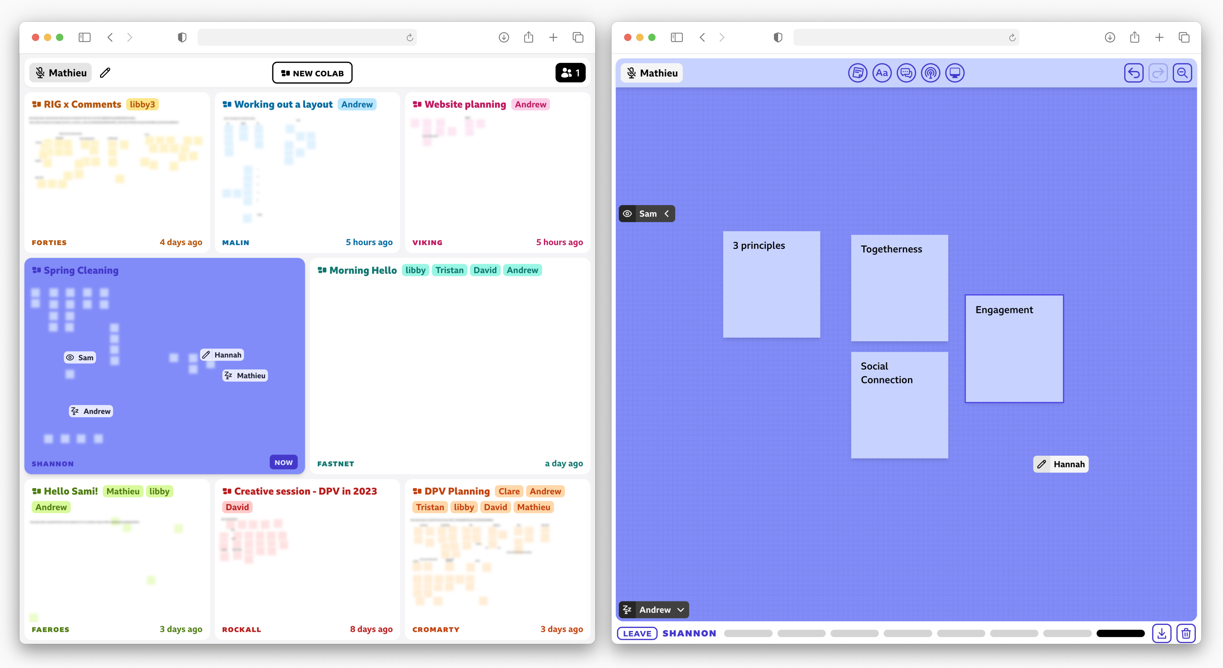
To enable togetherness as per the single shared space guideline, Colab has a lobby which shows all the rooms with a preview of their content and their occupants, past and present. Each room records past activity for future users. We hoped that by providing a level of transparency in what other users are doing, we would create a social connection through a sense of activity. So for privacy reasons, the preview of the content is always blurred and abstracted which means an observer can use it to infer what's going on but cannot get details. If the room is currently in-use, the preview and occupants update in real-time. If it's unoccupied, a user can see past content and occupants.
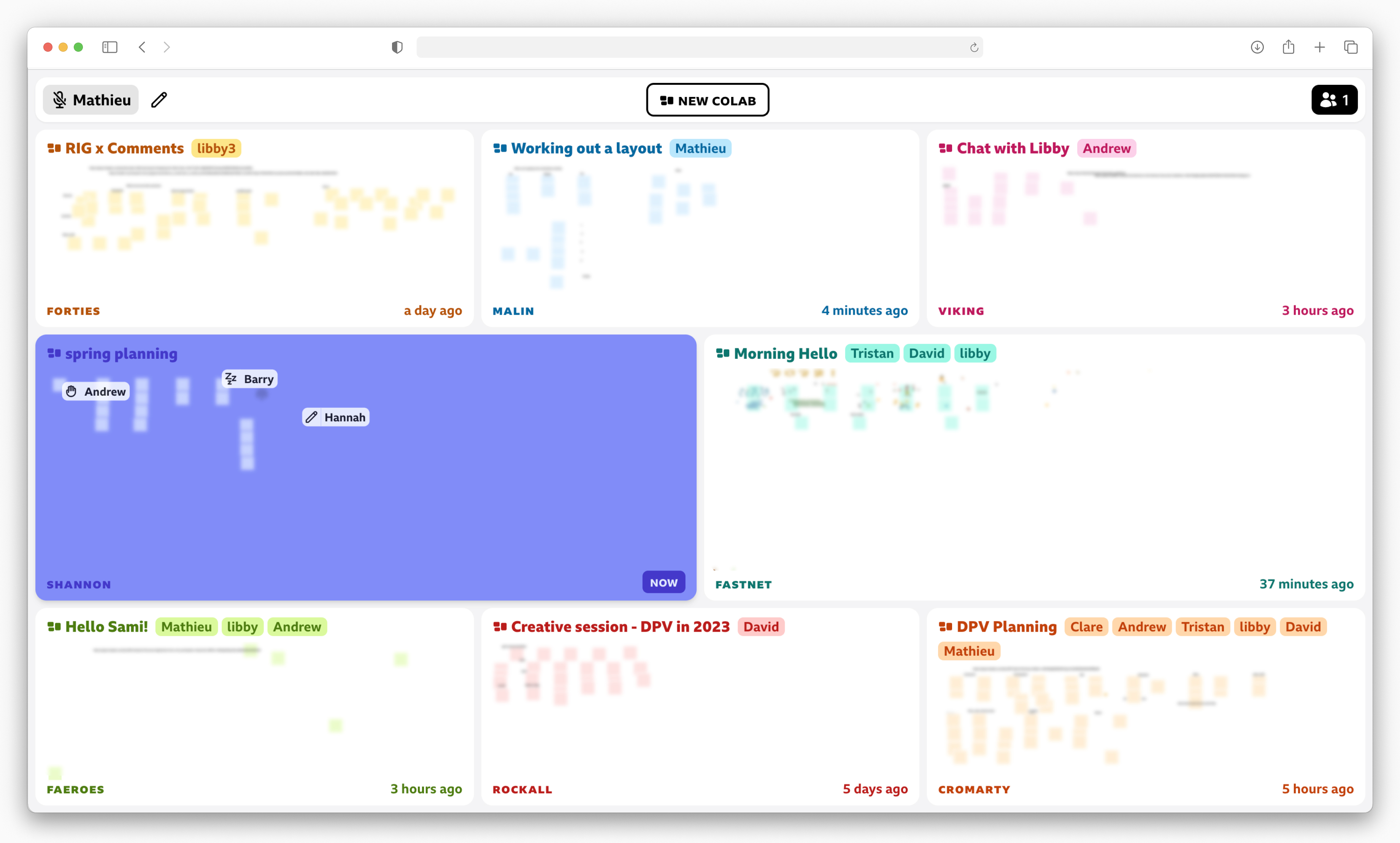
From the lobby you can see all the rooms and the blurred content of their whiteboards along with the occupant’s cursors
For the same reasons, we felt the users shouldn’t be isolated from the other rooms entirely when they're in a room themselves. We designed a slim activity bar which shows which rooms are currently used and who’s in them. To give an idea of activity, the representation of the room updates in real-time based on the number of occupants. Because rooms are intended to be spaces for focused work, the activity bar was purposefully designed not to be noisy or visually distracting.

The bar shows which rooms are occupied and who’s inside on hover
We chose to have a fixed set of 8 rooms (instead of creating a new room for each meeting) because we wanted to create a sense of place and permanence. Each room was meant to be re-used which we hoped would create more obvious and regular visual changes and thus a feeling of activity asynchronously without relying on notifications.
Inside the rooms and in the lobby's live previews, everyone’s cursor is represented and always visible. The previews show the whole board for each room but inside a room we can only see a part of the board at a time. So if someone is off-screen for you, we designed the cursors so they will stick to the edge of the screen with an arrow showing direction and distance. As part of RIG, we suggest that users should be aware of everyone’s intentions and actions as much as possible so each cursor shows an icon representing the user's current action (moving something, copying, pasting, editing, deleting, etc.). This means that even if everyone is off-screen, you can still get a sense of what they're doing.

The cursors are visible on the lobby and inside the room. Each cursor also has an icon representing what the user is currently doing.
Technical Details
We started with a custom version of tldraw for the whiteboard part of the application but decided to build a much simpler version from the ground up as we only needed a fraction of its features. However, to build a prototype like this in a reasonable amount of time, we relied on two third party libraries: Liveblocks and Livekit.
Liveblocks is a set of APIs and tools to create multiplayer experiences. They handle real-time updates for presence (cursors etc.) and state objects, along with any conflict resolution. Using Liveblocks meant that we could have a basic implementation of the lobby very quickly to validate the idea before going further. The Liveblocks team was kind enough to give us free credits for the duration of the development and testing.
Livekit is an open-source library which allowed us to implement the audio chat feature by hosting our own server. No other solution we tried came close in terms of flexibility and ease of use, particularly in terms of working with React. The audio connection felt really stable and the unprocessed audio had the unexpected benefit of letting users interrupt each each other more easily and hear casual conversation cues (such as "humm" and "yes"). We had to implement our own detection of speech when muted, but the maintainers have now added that feature.
In the initial design of Colab, there was a distinction between private and open rooms. However, this was never implemented and was not available during the trial. We also tried to implement ways for users to interact with each other across rooms but we didn’t think our implementation represented our intentions correctly. Eventually we relied on social norms for people not to interrupt each other or destroy work in progress.
The result is an app which has shown to be reliable but comes with the usual pitfalls of prototypes in terms of accessibility and cross-browser compatibility. The code is available on Github for anyone to explore. However, if you're interested in building a collaborative whiteboard, we'd suggest to take a look at tldraw — there is a new version in the works that's much more flexible.
User Testing
Methodology
We wanted to test Colab for an extended period of time with the same groups because of its mechanism of shared history which relies on repeated use to increase awareness of others and togetherness. We chose to complete this testing internally as BBC R&D has a number of labs across the UK and promotes hybrid working. We asked 4 teams to use it at least twice a day for a week and in total 24 people used Colab.
We provided an introductory session on the first day in the morning and suggested they use their afternoon session to get familiar with the prototype and explore the tools within it. Afterwards, we encouraged them to use Colab every day in their regular non-critical meetings such as social calls and creative sessions. We set up a Slack channel for communication with the participants and used it to suggest creative activities (in case they didn’t have a suitable meeting for Colab) and give daily hints about features.
Before the trial started, we asked the participants to complete a short quantitative survey about togetherness and connection in their current tools: Slack, Video Calls, Collaborative Documents, Whiteboard Tools and In-person interactions as a baseline. We sent another survey after the completion of the trial to measure similar metrics about Colab for comparison. We then chose a subset of 8 participants for semi-structured interviews of 45 minutes to get a more qualitative look at their experience.
Analysis
The analysis is broken down into three deductive themes derived from our conversation guide: Togetherness, Collaboration and Usability. The findings blend elements from the interviews and survey as needed.
Togetherness
Observing, I feel more connected to the department. Makes me realise there’s stuff going on around me, I’m not in a little silo. [...] We are respecting their privacy, we don’t really know what they’re doing, just like going past a conference room – you’re not pressing your ear to the door [...] Previous state gives a sense of connection because I don’t have anything else to know what people are up to.
Overall, the lobby and the activity bar were successful in creating a sense of presence and connection with other users. The lobby was often compared to a physical hallway or parts of an office, with users highlighting the ability to look into rooms. Only in-person interactions performed better than Colab in terms of connection with other teams. The recording of past artefacts from previous meetings (names, titles, content) along with changing icons in cursors successfully provided an idea of activity.
The cursor is moving, the icon is changing. I can see people are working.
However, reusable rooms seem to require a different mindset of sharing a working space which is traditionally private. This lead to some user frustration because of the lack of control over the data left in the room.
It doesn’t feel like voyeurism because I can’t see what he’s doing. I can see he’s using some of the tools but I can’t see what he’s doing. I’m ok to be watched like this because it’s about how much as I would be watched in a real office.
Colab succeeded in making users aware of past activity as well as who was there before them. It also worked well in terms of awareness of live activity. Generally, the level of transparency was perceived as acceptable, with some comparing it to how it would be in an office. Users didn’t feel like they were spying on others or being spied on. The blurred board was effective in giving a sense of activity without revealing details.
Insights
- Having a shared space showing everyone and their activity past and present is a good way to create presence and social connection
- Users found it difficult to work with spaces they did not own entirely
- Showing a record of activity in a global view is an effective way to give users a sense that other people are around and active
- Making sure cursors are always visible and visually changing based on user activity worked well to remind users that others are around and working too
- Users should be aware of what others will be able to see of their activity
- The level of detail of the activity shown matters a lot to respect privacy in a shared environment
Collaboration
I actually prefer that there isn’t video. Gets you into the work.
Generally people liked not having video, finding it more relaxing, easier to take part and collaborate. However, this was in the context of teams that already knew each other and some people found the lack of video a bit frustrating from a togetherness perspective.
Participants also found the experience of chatting on Colab better than other tools because of its unprocessed audio. They said it felt more like a real conversation/phone call, easier to interrupt and make sure that people have heard you as you can hear any short cues such as “hmm” and “yes”.
Easier to talk to one another compared to Zoom. Good to talk over each other, it took 2/3 sessions to realise that it was easier than it was in Zoom. Facilitate conversation more easily.
The basic tools worked as expected and users could use them to have creative sessions. Screen share was more necessary than we thought and once included was used and appreciated. Attracting attention was mostly done through voice so the beacons were liked but under-used. Threads were seen as too strange and generally disliked.
Not expecting threads to disappear. If used for note-taking it would have been annoying. Didn’t really use tools to attract attention, mainly used voice. I liked the Beacons. Used them to get attention at start but sometimes too many were used.
Insights
- Not having video seems to be better for collaboration but worse for togetherness and works primarily for groups that already know each other
- Real-time audio with no processing has unexpected benefits of making conversations more natural and free-flowing
- Ephemeral conversations may be useful but the implementation was too frustrating
- Beacons were liked but might be more useful in an environment where users can’t talk to attract attention
Usability
Participants thought rooms would benefit from labelling, particularly as open or private to know if you could join. They wanted to ways to interact with others on a light social level (waving/hello) but didn’t want to interrupt, suggesting we need some labelling for welcome interruptions.
Put off joining another team in a room in case they are busy — just like in an office. I would not knock on the door of a busy meeting. ‘can pop in’ notice would be useful — ‘do not disturb’ could be useful too.
The prototype seem to work fine for most participants and was praised, however when pushed to the limit with many users and many stickies, there were slow downs and the app was less responsive. The UI also had a few issues, notably the zooming feature and the “new colab” button were almost completely ignored. There was a need to see the whole canvas but the all/nothing zoom was not compelling. Lastly, with lots of people in one place, the cursors could feel overwhelming to some users, making the names hard to read. Additionally, the difference between the present and past name tags/cursors was thought to be a little ambiguous.
When I first saw it I was completely confused, cursors whizzing everywhere. Liked it but could be distracting if it’s going a bit crazy.
Insights
- Relying on social norms for a shared space is effective but a clear presentation of boundaries and ways to cross them might be appreciated
Conclusion
Based on our goals and challenges, the modified version of our single shared space guideline was successful in creating presence and social connection for large groups. Particularly, the broadcasting and recording of activity in the lobby and the activity bar were effective in increasing awareness of others asynchronously. Importantly, it seems that the majority of participants were comfortable with that level of transparency and data collection in regards to their privacy.
Additionally, the prototype was generally praised for its functionality and usability by the participants in the testing.
Based on the feedback, we will look to improve parts of the UI, for instance the distinction between past and presents in the name tags and cursors. Features such as locked rooms and light social interactions/interruptions should also feature in a future version.
Perhaps, the key insight here is that for large asynchronous groups to feel together and connected, they need not only to share a space, but to share it in time.

The prototype code is open source so you can run it on your own machine or server
DownloadFurther Reading
This project is a continuation of the work started in What can board games teach us about remote interactions?
