As BBC R&D looks towards the future of public service media on the internet we think that participatory technologies are key to better serve our audience’s needs. They give people a voice and agency, but also let them connect, communicate and collaborate. In this new reality where teams, families, friends and other groups are all distributed and apart, we want to address these needs, particularly in terms of togetherness and social connection.
The existing tools we all have available, including video calls and social networks, go some way towards achieving these goals but we think we can design more healthy and successful spaces with the specific goal of bridging the remote gap. These experiences should maximise connections between people, provide shared public spaces, welcome everyone and keep them engaged with their own intrinsic motivations.
The Guidelines
These guidelines are the result of a two year research project by BBC R&D. During this time we developed and tested two prototypes which we used to discover and validate these insights.
Explore our research and prototypes to find out more
Read moreTogetherness
To increase feelings of togetherness, we found we needed to make users aware of each other in space and in time. So our recommendation is to start by providing a shared space where everyone is represented. Then, you should show what everyone is doing, what they’re intending to do and what they have done. The time dimension is particularly important for asynchronous groups. Making users aware of past actions makes them feel less isolated.
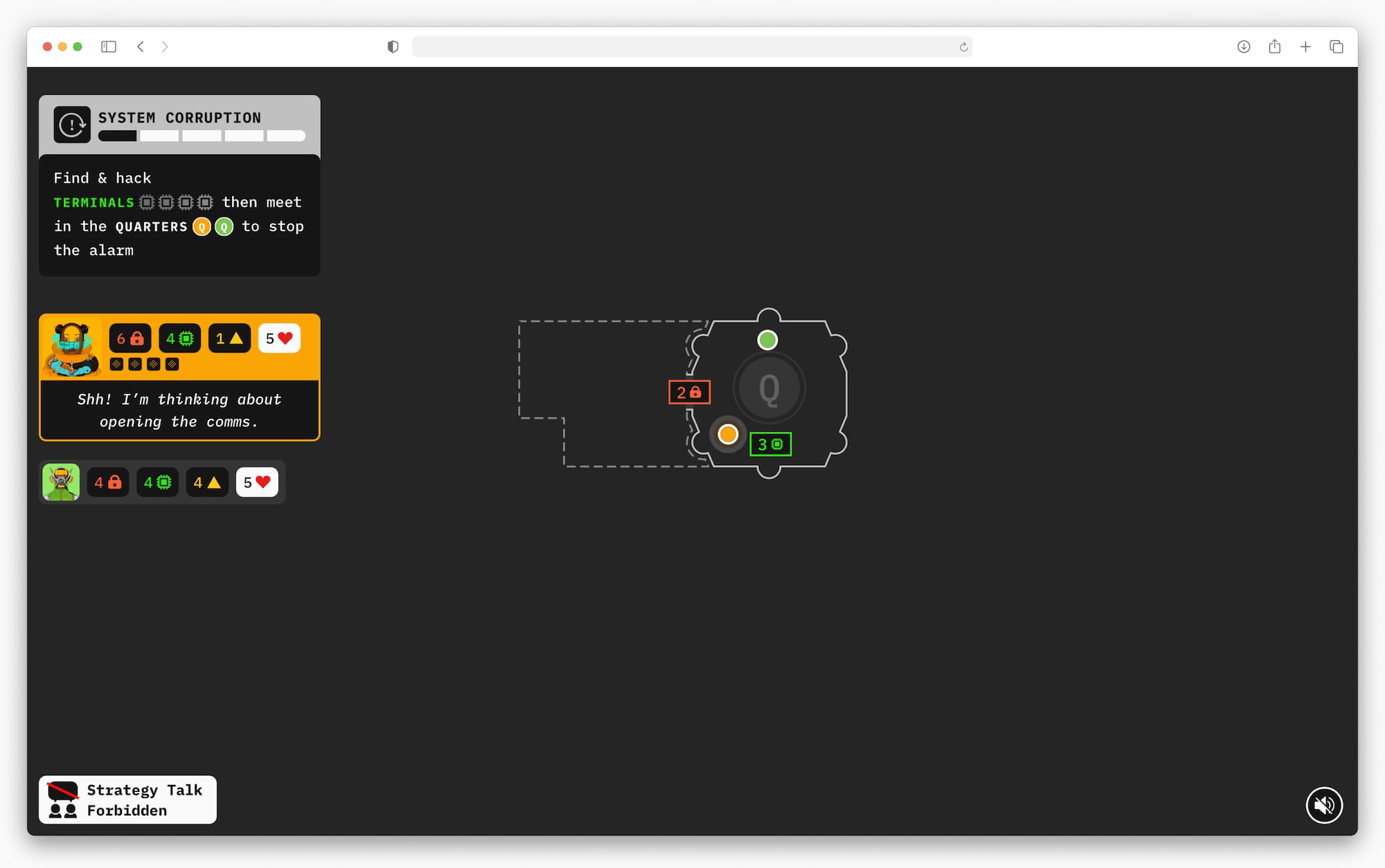
Here, the board shows everyone’s position and what players have done so far. The left-hand side shows who’s currently active and what they’re doing or thinking of doing.
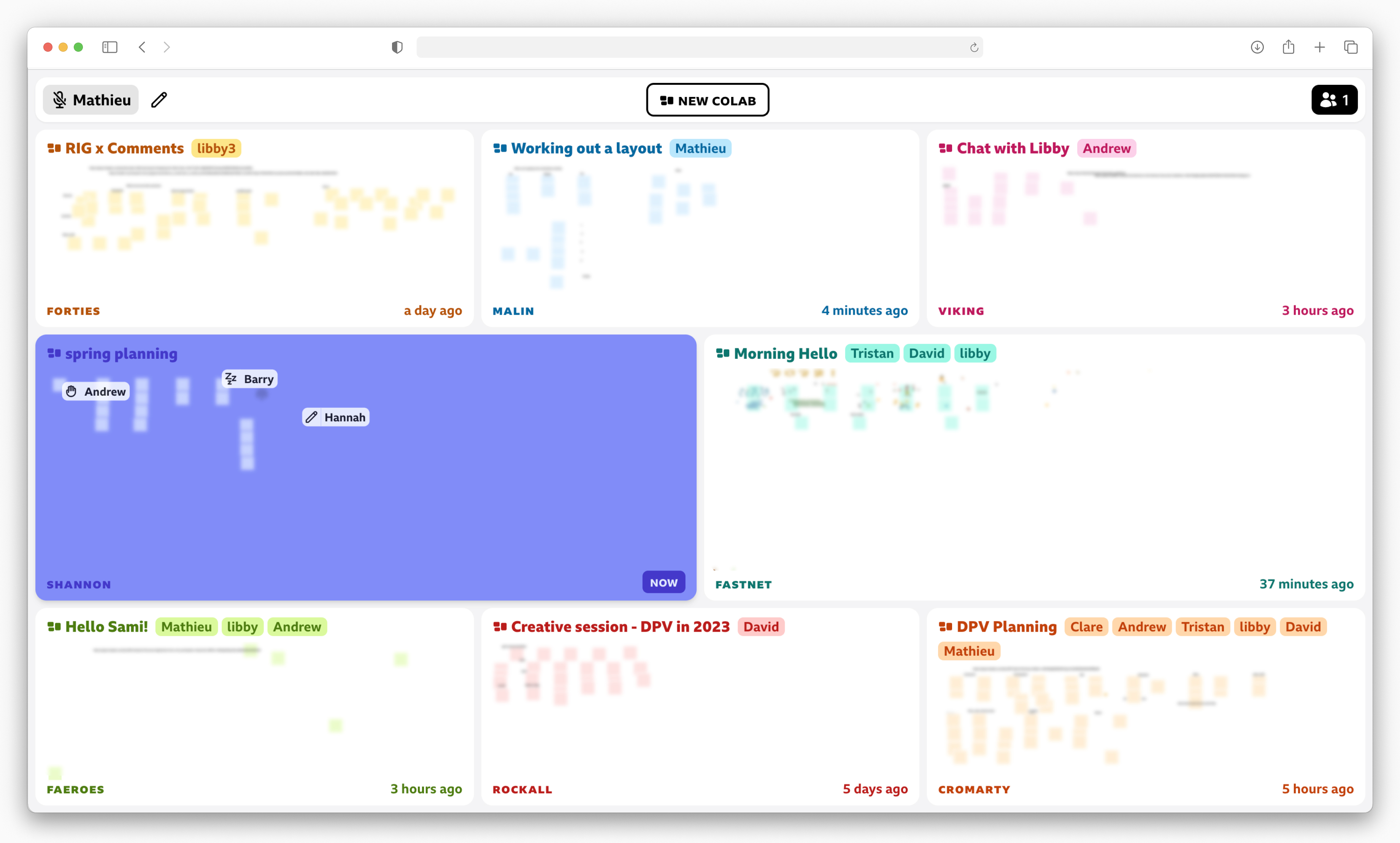
This overview of virtual collaboration spaces shows everyone and their activity. The live cursors show intention through movement and iconography. Past activity is displayed in the empty spaces which is essential for asynchronous work.
Social Connection
To create social connection between users, we found we needed to encourage communication and find ways to make everyone feel valued as part of the group. Set a common goal, then give everyone a different and complementary role. This will force users to collaborate in order to succeed. However, you should offer opportunities for users to work things out independently as you need to avoid a single user taking control of all decisions.
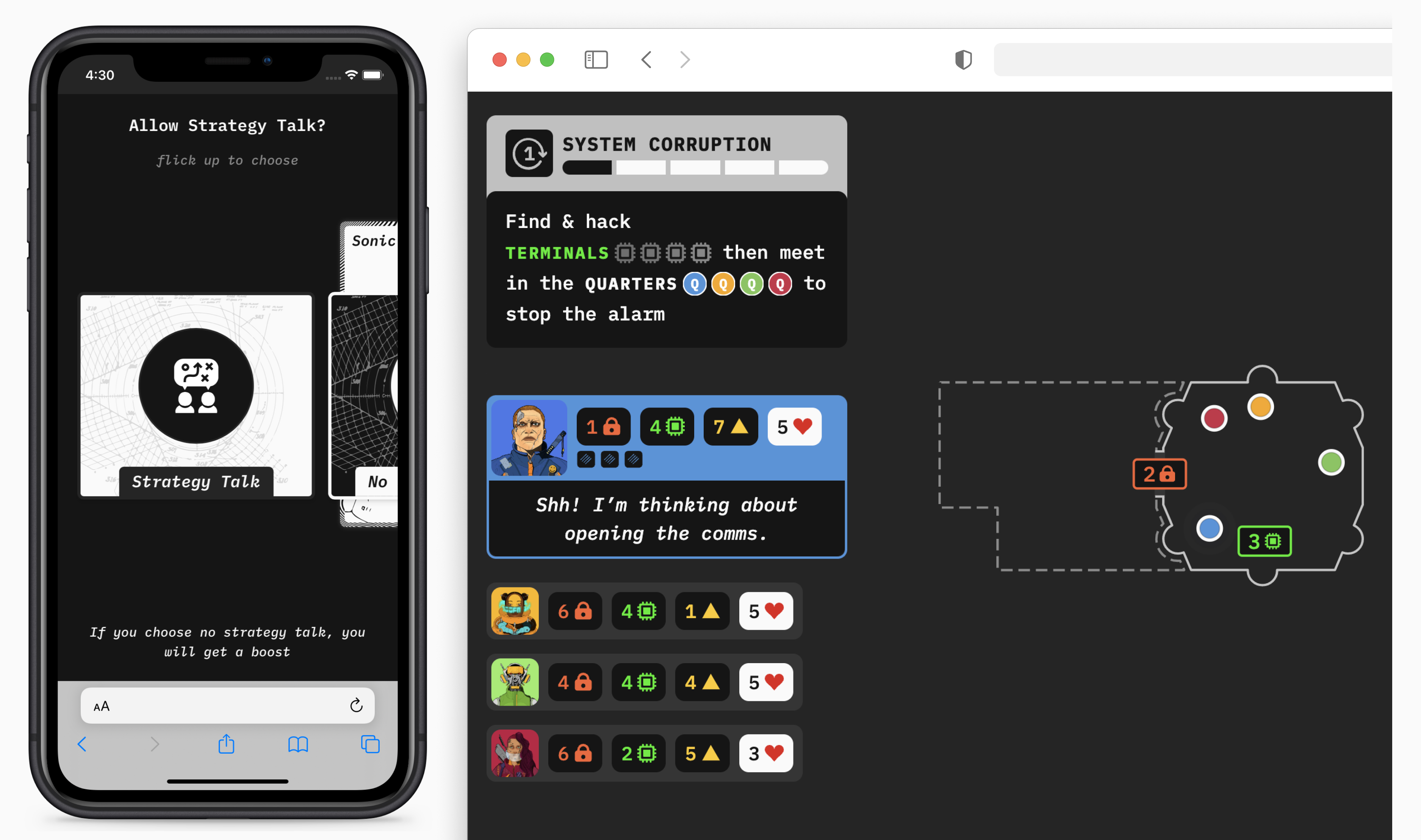
The top part shows the players’ goal and underneath there is a list of characters with their strengths and weaknesses. A player can choose whether or not to be independent for a turn (opening the comms).
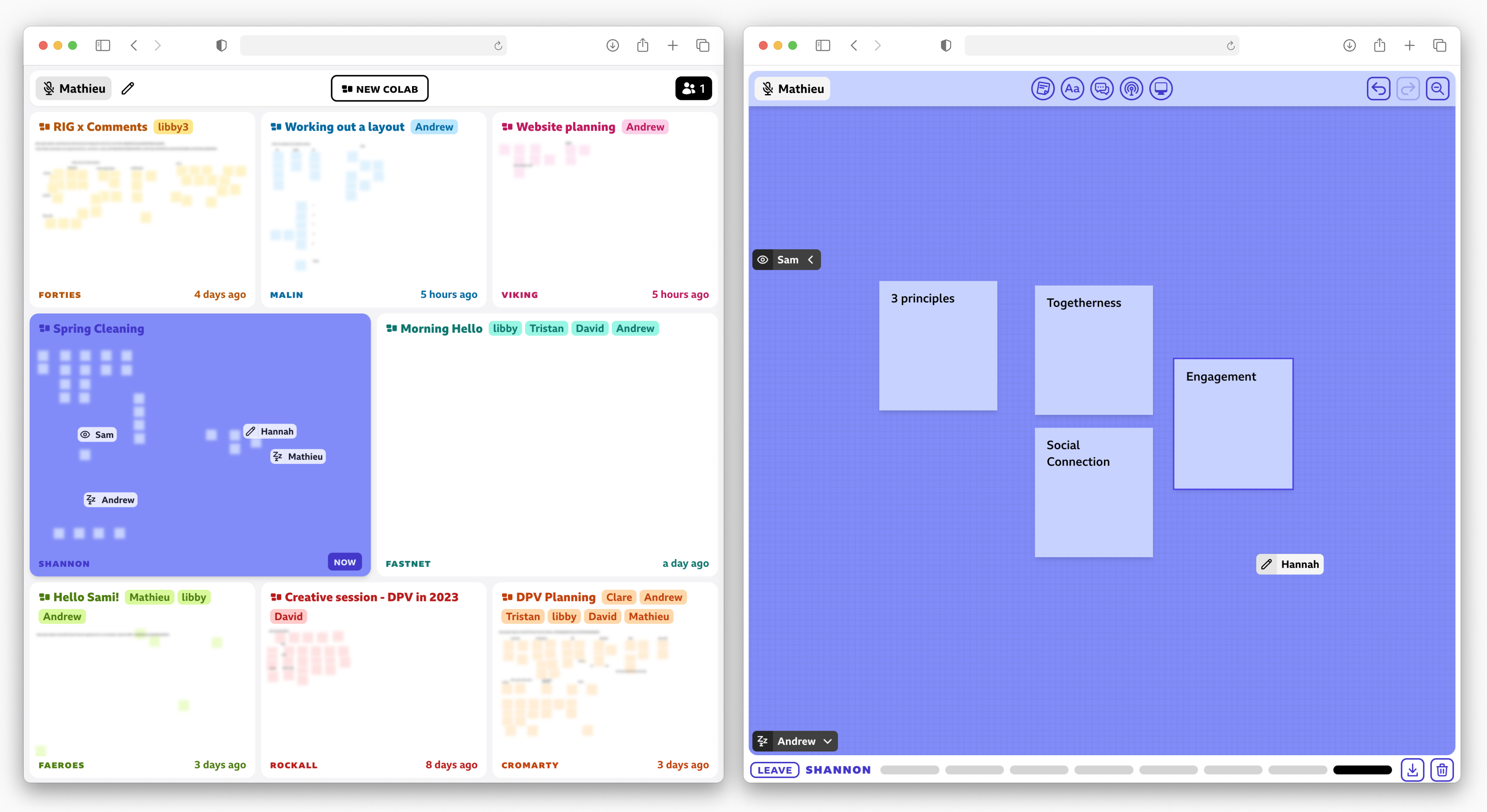
Work teams naturally have different roles and a common goal so we did not explicitly implement them. A user can move to another part of the canvas to work independently if they choose to. The rest of the team can still get an idea of what they’re doing through the icon in the cursor.
Engagement
To make sure everyone is engaged, we found we need to keep everyone focused, interested and invested in the experience. Have the content of the space change over time, and if possible as the result of users’ actions. You should also break up the path to the goal into small milestones and visibly display the group's progress. Where appropriate, create uncertainty or pressure and share successes and failures with everyone. This helps create anticipation and encourages users to pay attention to others.
The board changes as it is explored. Some actions require revealing a random card which is displayed on the board so everyone can understand whether it succeeds or not. The top-left shows the progress towards the goal as well as a countdown to disaster.
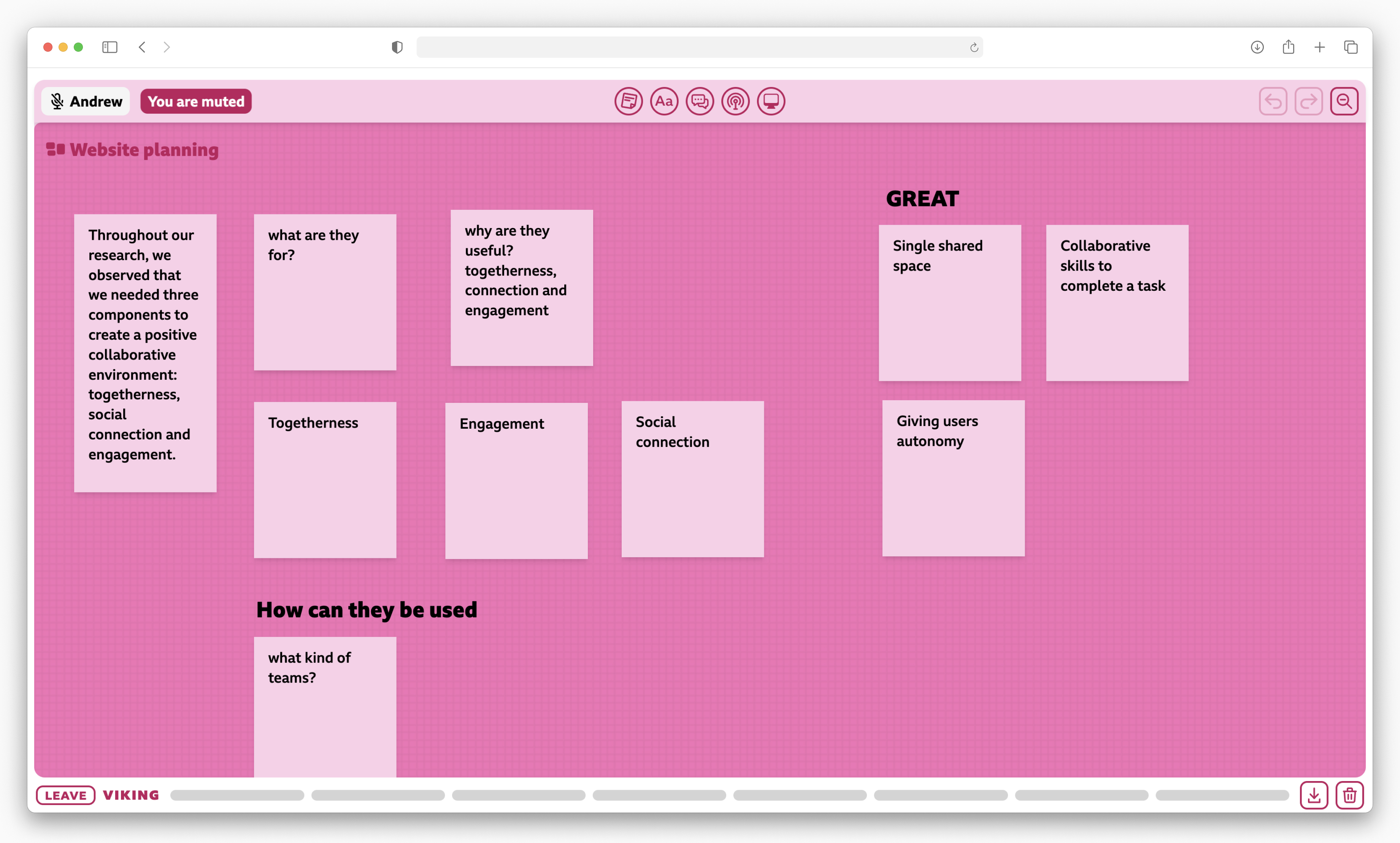
Random outcomes are generally not suited to productivity applications and deadlines are part of the usual workflow so we chose not to add them to the prototype. Both the overview screen and the board change as they’re being used.
Applying the Guidelines
Based on our experience with the guidelines, we developed a short creative exercise that teams can do together to understand how they can be applied to their work. There are two steps:
- For each guideline, find as many physical and digital examples of its application as you can (there tend to be fewer digital examples)
- Then pick an example (or find another one) from each list and combine them all into a cohesive idea
This technique is particularly useful to generate lots of ideas and get a more tangible understanding of the guidelines and what it feels like when they’re in use. After this, depending on your needs, you can design wireframes based on the concept or write a few paragraphs about how it all comes together.
Finding examples
To yield the most combinations, we found that it was easier to break down the guidelines into short questions so we prepared a worksheet you can use to get started.
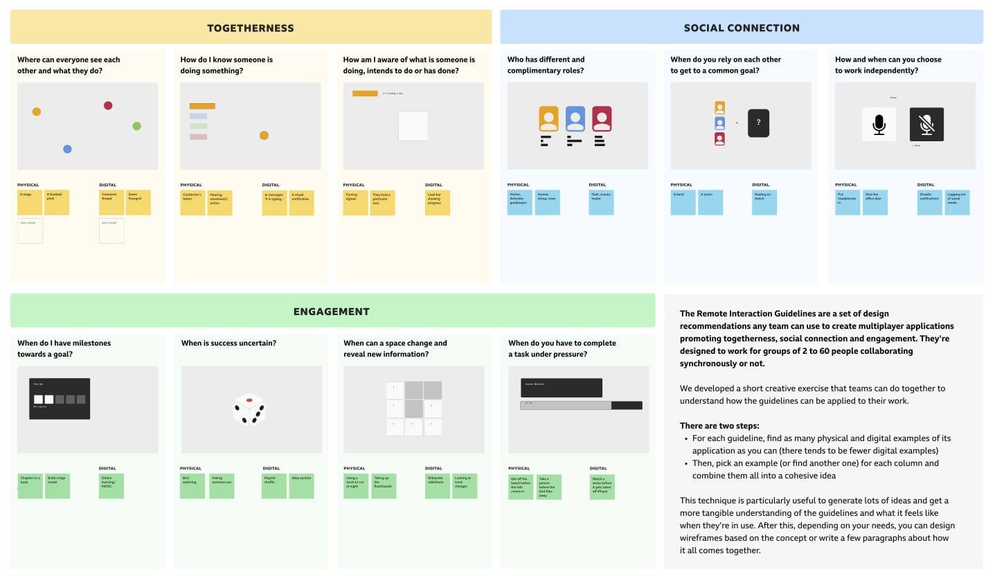
The template includes useful questions and examples
Download